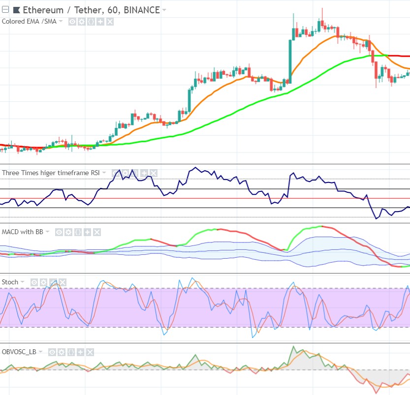
As said this example will also include the EMA15 (the orange line in the chart below).
Trend
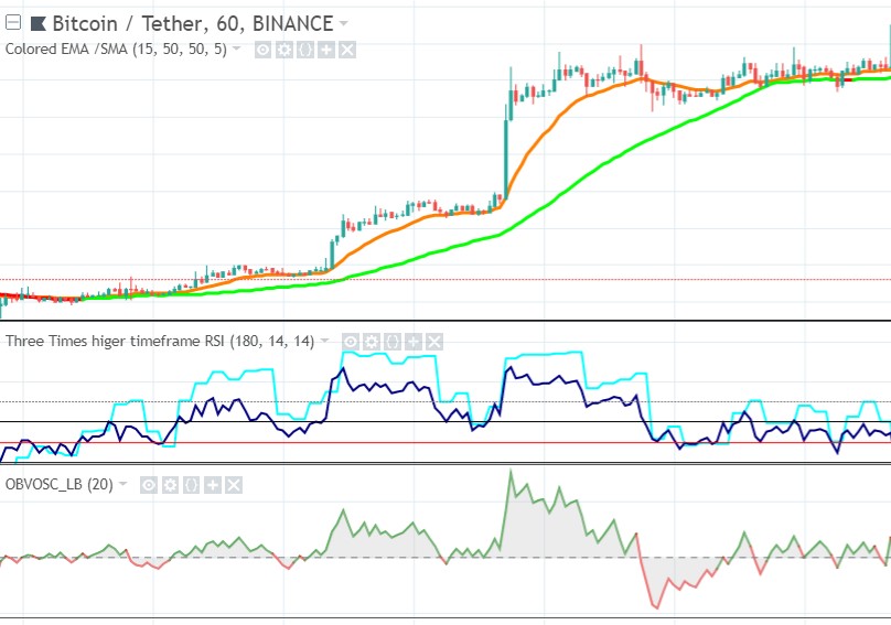
You see we have a clear upsloping SMA50: uptrend. I have dynamically colored the SMA50, when it slopes down it is rendered red, when it slopes up it is rendered green (the color might be a bit lagging compared to actual sloping, but that is to filter out noise).
Momentum
- EMA15 moves up and away from the SMA50, indicating strength, that’s what we want, a strong uptrend.
- Already in the first wave you see RSI rising above 60. RSI above 50 indicates bullishness. But RSI has to get above 60 at the wave highs for the uptrend to be strong enough.
- At the wave lows (bottom of the retraces) the RSI stays well above 40, our support in an uptrend, it even stays above the RSI 50 line at the first retrace (very bullish). The higher above RSI 40 momentum stays during a retrace the more upward strength is has, so that is good. Remember never to buy an entry below RSI 40.
- Volume looks perfect also, at the bottom of the retraces it remains well above the zero line, indicating buyers dominance:
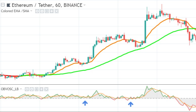
- Once price drops below SMA50 and trend reverses to downtrend, you almost always see volume dropping below zero and turning red, sellers dominance. This is very normal behaviour, because we want to see volume confirming price action.
Chart Patterns
These swing lows (or retracements, retraces, correction waves, pullbacks or down cycles, if you will 🙂 ) I am trying to catch the bottom of, often bounce of support levels. That is why it is very important to know all support levels nearby and which one you run into next. For this I often zoom out my chart a little bit to get a better picture what I am dealing with. This is what I found in this chart:
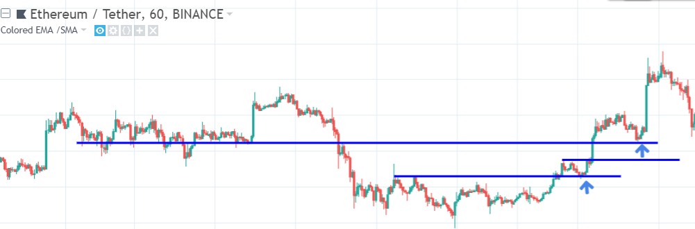
Nice, as you can see there is “confluence” between these support levels and the signals the other indicators gave me.
Higher Timeframe
For higher timeframe confirmation, I only look at Momentum. So here I have the zoomed out RSI indicator.
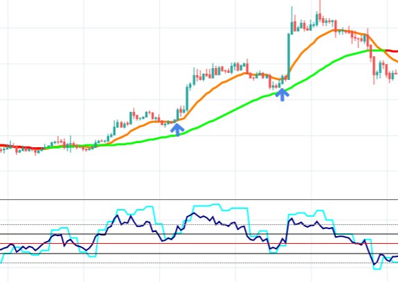
As you see I have added a light blue line, this is the higher timeframe RSI (I added it into the 1 hour timeframe RSI for illustrational purposes). What I want RSI to do is stay above 40. Whenever I see an RSI break below it, doesn’t matter whether on the current or higher timeframe, I cancel the entry. I have learned that sometimes the lower timeframe better predicts a bad entry, and sometimes the higher timeframe. So first I want the lower tf RSI to bounce up off the 40 level, and when it does, I look at the higher tf to do the same, to confirm it also stays above 40.
Timing
Now we look at timing our entries. First we look at the Stochastic indicator (Stoch), my most important timing indicator:
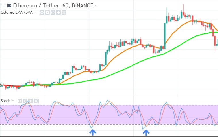
- What you want to see is that Stochastic crosses up above 20 (the lower dashed line) as indicated by the arrows. This is a very powerfull indicator. But in practice there is one issue: sometimes price makes a complex ABC retrace (double-bottom), as you can see at the second arrow. Sometimes the double-bottom implies that price will drop even further down, before bouncing back up. To deal with this uncertainty I sometimes look at a second timing indicator to confirm my timing: the MACD/ Bollinger Bands combination (as explained before).
- On the MACD/BB I want the MACD to reverse upwards and preferably, when bouncing off of one of the BB lines, preferable bouncing off the lower BB. In this example we are in a very bullish uptrend, so that’s why MACD bounces off the upper BB. But although it is a very bullish signal, be careful, because it can drop lower as price drops below EMA15, or even below SMA50. That’s why I prefer a bounce off of the lower BB level. If MACD is below the lower BB level, a reversal of MACD is not enough, in such case it’s safer to wait for MACD to cross above the lower BB, before you enter.
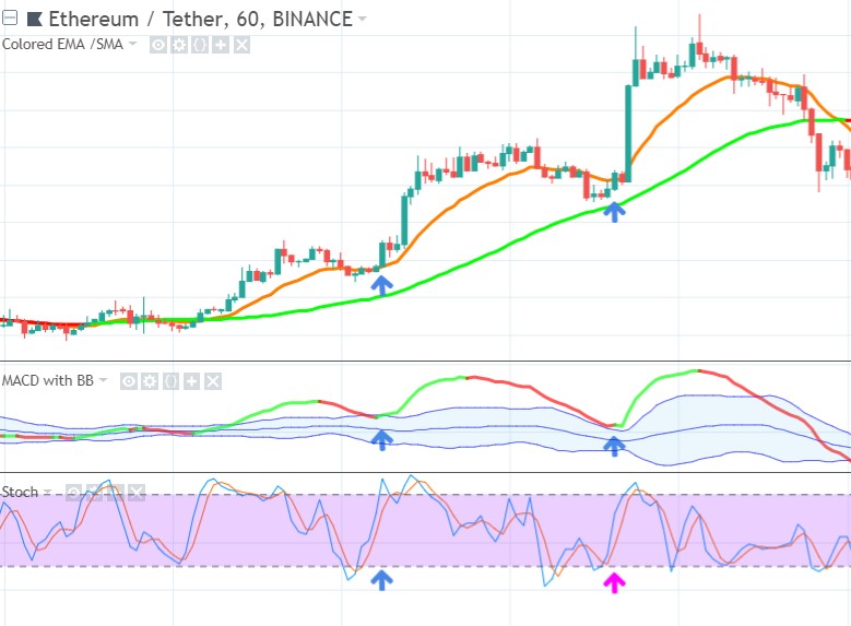
- As you can see the MACD is a bit lagging compared to the Stoch, but we only use this to filter out the bad Stoch signals, like complex retraces. As you can see at the magenta arrow, because of the lagging MACD, we enter right after the double-bottom, protecting ourself in a potential complex retrace to a lower price level.
Again I have dynamically colored the MACD, when it slopes down it is rendered red, when it slopes up it is rendered green (the color might be a bit lagging compared to actual sloping, but that is to filter out noise).
Depth Chart
As you can see in the Depth chart below the buyers are more dominant (I took this image during the first wave low). It looks good, although not an amazing signal, but good enough:
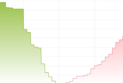
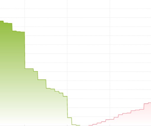
And in the second wave low it looked even better, as sellers lost even more ground (see image below). But always take the depth chart with a grain of salt. It gives you a last-minute view at what people bid and ask, but as you will find out this often isn’t exactly how the actual subsequent trades will look like, because as the market moves people change their orders accordingly, delete them, add new orders, etc. Next to that there is always price manipulation, as in every other market. So you really need to see this depth chart in the context of the other 6 views you have at your potential entry. It’s just another piece of the puzzle.
Bitcoin Correlation
As you can see in the image below Bitcoin confirms the bullishness. I am most interested in Bitcoin trend and momentum. Trend looks perfect and momentum is strong also. EMA15 well above MA50, RSI goes above 60 in the swing highs, Volume doesn’t really go below zero in the swing lows. I didn’t find any resistance lines that could exhaust our potential run up. Bitcoin depth chart looked bullish also.
Also the bigger scale structure of Bitcoin didn’t look concerning at all, no major support, resistance, trendlines, triangles, etc. up ahead. I check this because Technical analysis is for a big part a self-fulfilling prophesy, most people use it, so price behaves accordingly. That’s why I try to see the bigger picture, try to see what other people see, to prevent that a trade turns against me, because I am zoomed in too much. So I always start my day looking for the overall sentiment in the market.
Click below for the next example.