
At the end of the day, the most important thing in trading is: Price.
For me one of the most important aspects of chart analysis is to look at the structures on a “naked” chart, plain price action: drawing support/ resistance lines, higher highs, lower lows, etc. It is often the first subject you encounter when learning Technical Analysis (TA). Supports and resistances are (major) highs and lows on a chart. They represent the price levels where buyers or sellers step in.

You can see them with the naked eye. In fact all traders see them, and make trades based upon them. So they have a self-fulfilling nature, as many things in TA.
Let’s start with real chart examples, as a chart speaks more than a thousand words 🙂 The following is in fact a very powerful Chart Structures mini-course.
(maybe the best part of this course) Enjoy!!
Chart Structures mini course
In the following mini-course I will take you by the hand and give you
a practical in-depth look into basic chart structure reading.
When you have finished this mini-course, you will be a Pro in reading Chart Structures. Charts will easily open up to you, and you’ll be able to determine where price will probably go next. Being able to read chart structures is a skill that will effectively improve your results, and is essential for any Pro trader.
1. Finding early trends with supports and resistances
2. Following trends and finding the end of the trend
(Although the charts can look a bit intimidating at first, don’t be put off by that. It is not that complicated at all, you’ll see)

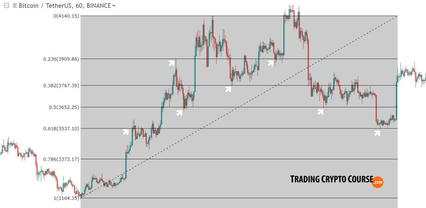
Btw Isn’t it really amazing how close these crypto charts respect the Fibonacci lines often. But Fibonacci is outside the scope of this mini-course. More about that in my free Fibonacci Retracements lesson.
3. Failed trend reversals attempts
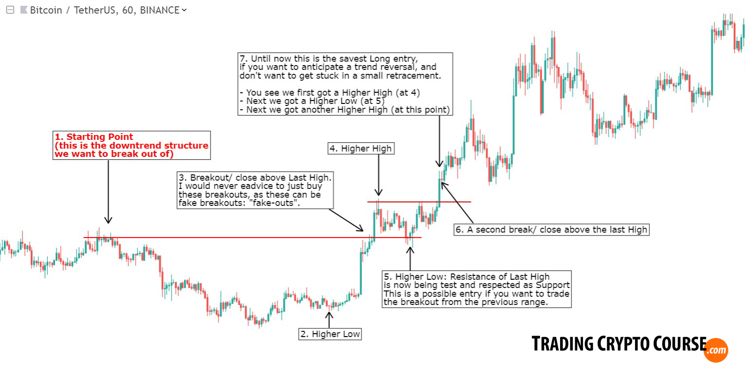
The Chart structures on the above chart, obviously show you that a higher low, and even a higher high, doesn’t mean it is the end of the trend, and next you get a reversal. That is why I wait, like in chart 2 for these steps to play out:
- first a higher low (sometimes this step is skipped)
- next a higher high
- next a retracement
- after the retrace price needs to break AND close above that higher high.
Because the first higher high can still be a fake breakout (happens often). Next many traders buy after the retracement, but even then the first higher high can still be a fake breakout. Only when it close above the first higher high, you get a confirmation that that high wasn’t just a probe.
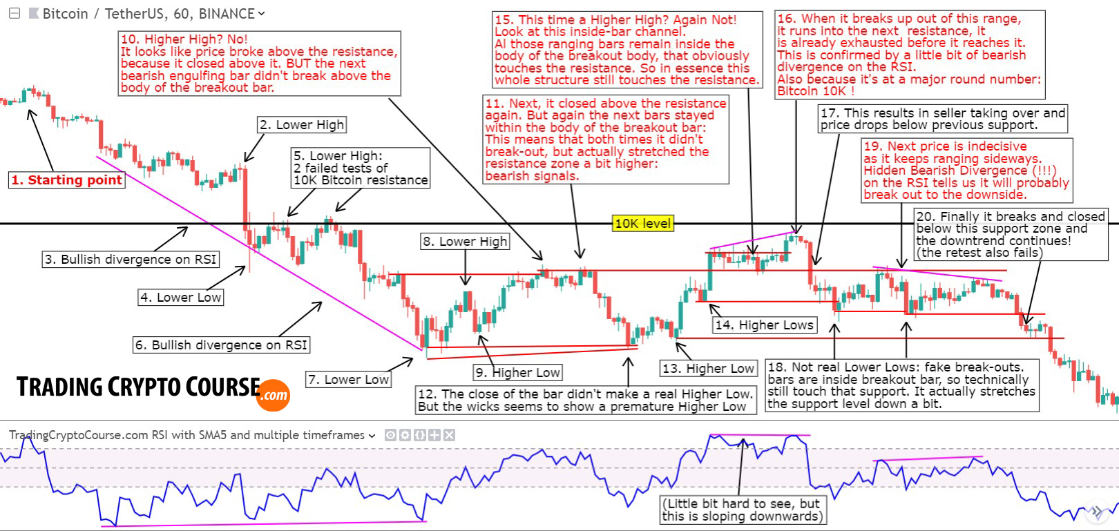
4. Chart Patterns with RSI divergence confirmation
(Again, don’t be intimidated by the looks of the chart, it’s not that hard at all 🙂 )
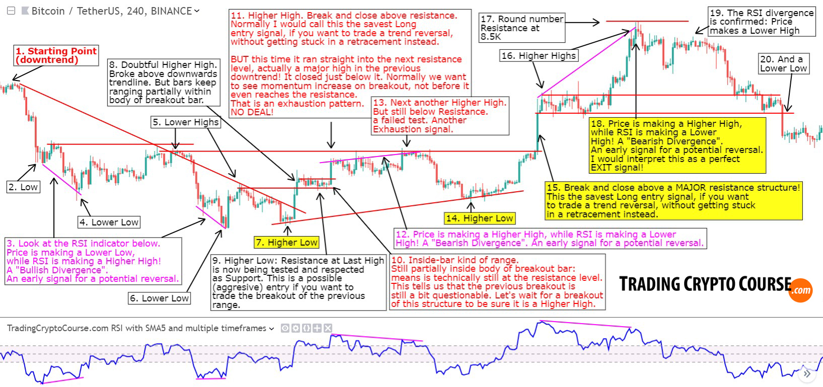
This chart gives you both a failed reversal attempt, and a successful reversal. In this chart I have added RSI (momentum) for extra confirmation. I didn’t use the RSI level, but divergences, because I really like them, and they give an early signal of a potential reversal/ end of the trend. More about divergences in my free divergences lesson. As you can conclude from these charts: I don’t try to catch the whole trend, I just try to get a high-probability piece of the cake 🙂
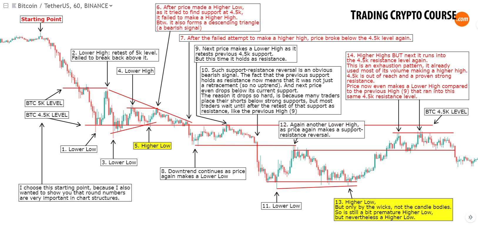
5. Another failed reversal attempt
I chose this chart example to show you WHY these 4 steps (mentioned in example 3) are actually crucial. Because in this example you have: multiple higher lows, a failed higher high, and next some sort of weak fake breakout.
If you would buy this first “higher high” breakout you would get stuck! That’s why I wait for the retrace, and even then keep waiting for it to break and close above this higher high.
In case of such fake breakouts you often won’t see it break and close above it again at all. Better safe than sorry.
After this failed reversal attempt, the trend continues on its way down, so what we dealt with here, was a trend continuation. An upward retracement, or “correction” wave, in a dominant downtrend.
6. Entry and exit a trend plus mean-reversion
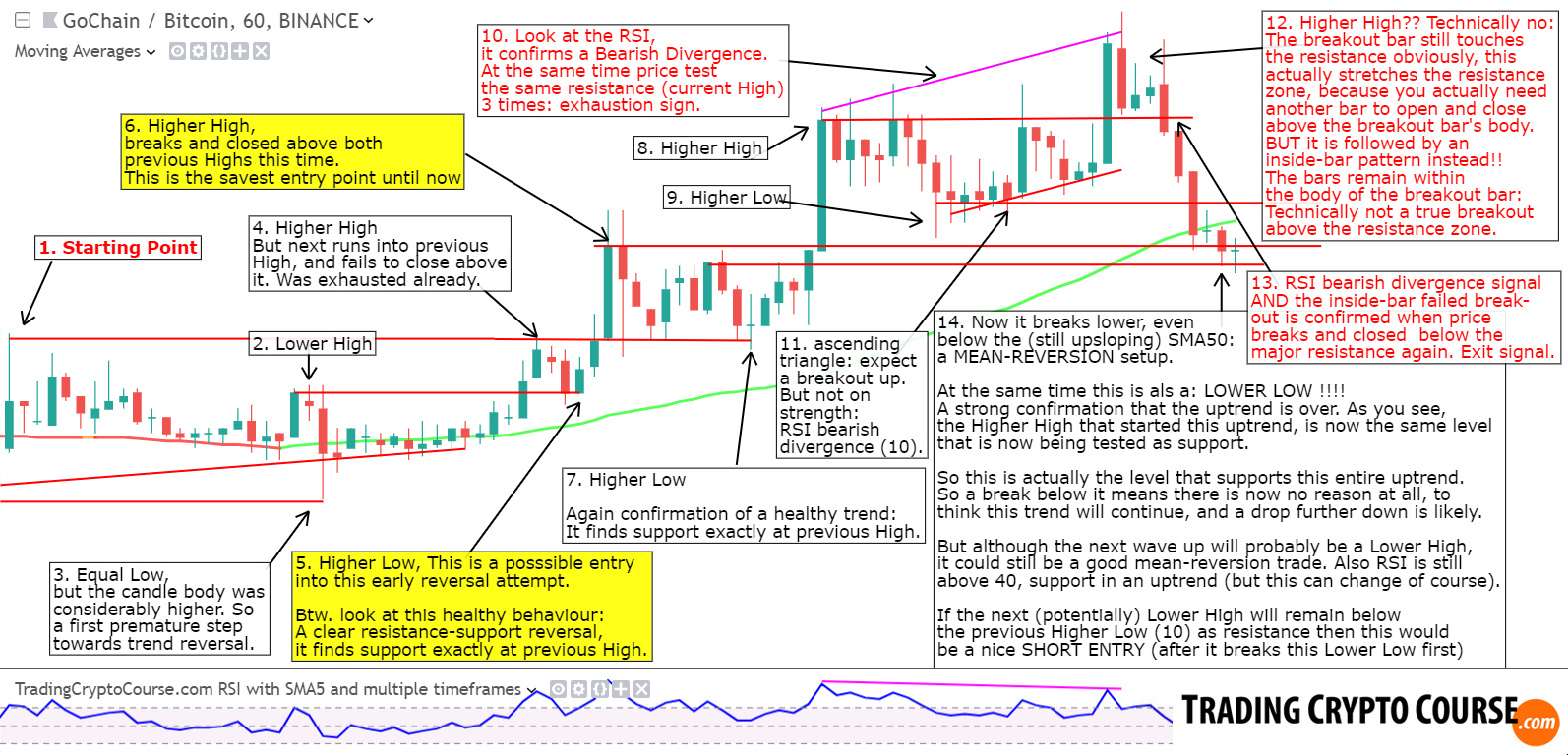
The above chart is another example how you should use chart patterns to find save entries and exits in and out of a trend. Again I use momentum (RSI) as confirmation of the exit. I also show you one of my favorite setups in this example, the mean-reversion setup. The final high in this trend is actually a fake break-out pattern, so it actually is a double-top in disguise, a reversal pattern. Big traders often use these “fake-outs” to get the liquidity they need (from smaller traders), that’s called “stop-hunting”. But more about that after this mini-course.
7. Premature uptrend followed by indecisiveness
The following chart shows you a premature reversal, and how to get a piece of those opportunities. Also interesting to see how we can easily deal with indecisiveness. Many trading systems get hurt by whippy indecisive charts, but through basic chart patterns you are safe.
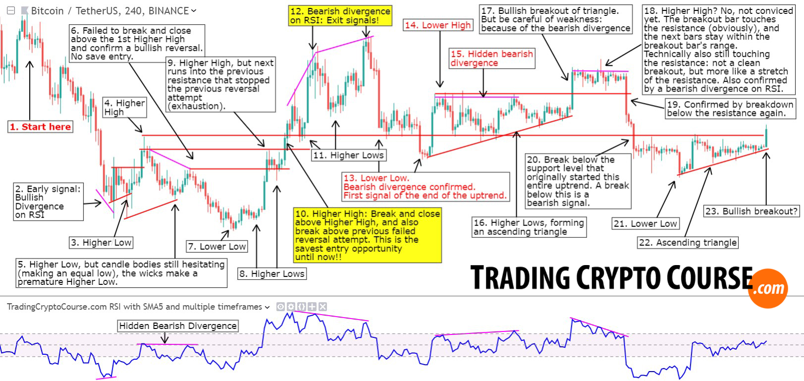
As you see inside-bar patterns play a big role in ranging markets. Actually inside-bar patterns often tell you if a breakout is sustainable or is more likely a failed attempt. Btw. true indesiciveness is often confirmed by RSI ranging between 40 and 60 (around 50), as you can see in the previous chart. On the RSI indicator the outer dashed lines represent these RSI 40 and 60 levels, the area is purple.
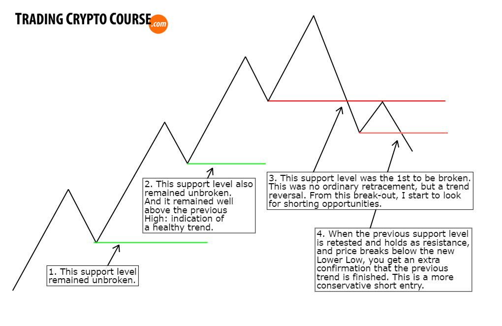
8. Retracement or reversal?
In the next schematic chart example you see how I distinguish a reversal from a retracement, using only support and resistance chart patterns.
Next I have added a SMA50 (50 period simple moving average) to the same chart. This shows me 2 mean-reversion opportunities. This chart is meant to show you that mean-reversion setups late in a trend are very dangerous, and often result in a trend reversal.
You see that the using only the slope of the SMA50 as indication of the trend can be dangerous if used without proper reading of the structures on the chart. More about these mean-reversion setups in bonus chapter 1.

So the conclusion is that mean-reversion setups are really interesting. Because:
– When confirmed by chart patterns they’re excellent setups.
– But when there is a divergence between the slope of the SMA50 and what the structures on the chart tell you, then it could be an excellent trend reversal signal: in the above example a perfect short entry. But trading a mean reversion setup AFTER the chart patterns already confirmed a (early) trend reversal, then this is very dangerous.
9. How to trade reversals? (schematic)
Always good to look at things in an organized and structured manner, especially because the real-world isn’t that structured at all 🙂
Look at this schematic chart example as often as you like. This is the essence of what trading trend reversals through chart patterns is all about.

10. How to integrate Moving Averages
Moving averages are dynamic support and resistance levels: S/R levels that are constantly moving. It is very important to know their importance and how to integrate these when reading chart structures, The following example might look a bit confusing with all those lines, but it is actually quite simple. I have added my favorite 3 Simple Moving Averages, the SMA50 (red), SMA100 (orange) and SMA200 (yelow). So next to the basic chart structures, all these SMA lines can also act as S/R levels.
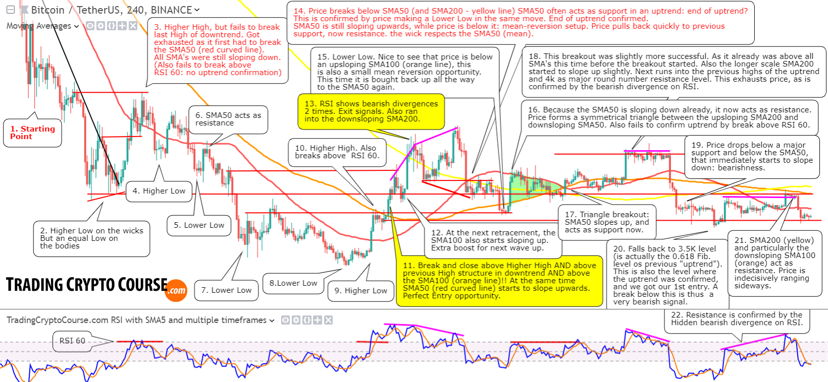
As you probably have seen in this example, I also look at the slope of the SMA’s. This is very important, an upsloping SMA gives bullish momentum, and a downsloping SMA bearish momentum. But it is also important where these SMA lines are relative to eachother, price and chart structures.
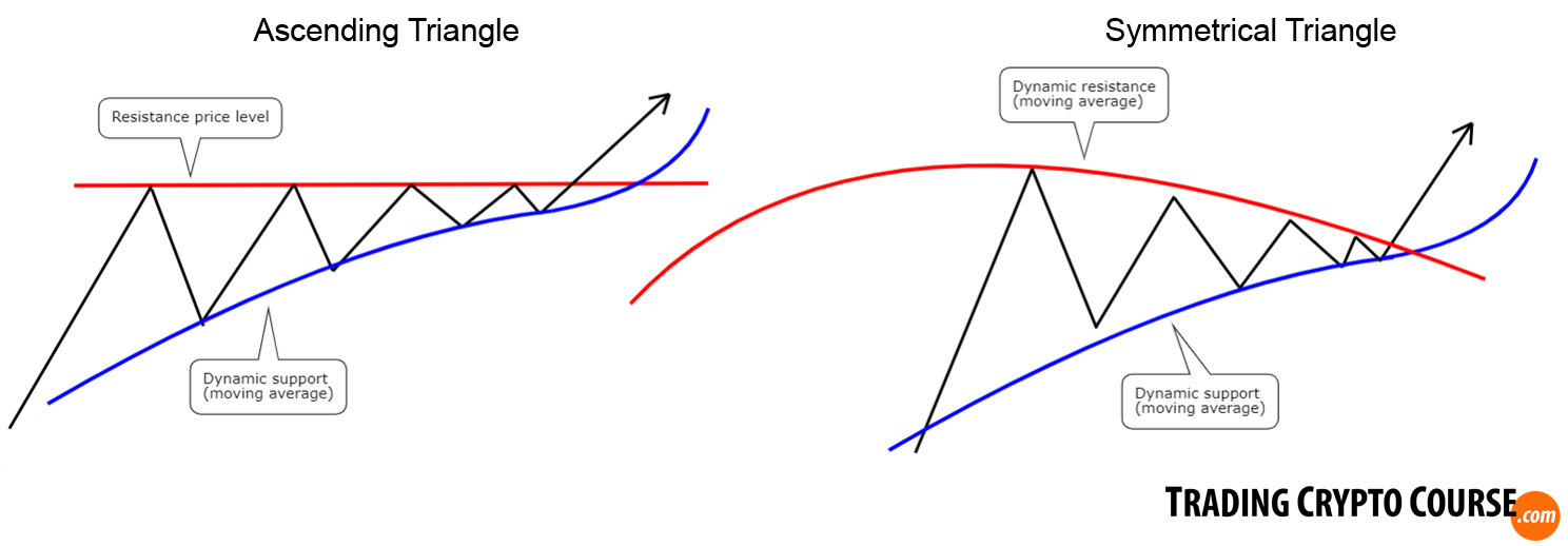
Also nice to see that 2 SMA’s converge, and price bounces inbetween, forming a symmetrical triangle pattern. This is something that you will see quite often: price forming a symmetrical, ascending or descending triangle, based on interactions between price, dynamic S/R lines (SMA’s, EMA’s) and static S/R price levels. It is actually a “squeeze” between these static and dynamic lines. Like in this example:
The more SMA’s give a confirmation, the more timeframes it will be visible on and the more traders will anticipate it: the stronger the effect. In the next example I will go more in-depth into timeframes.
11. Chart Structures and Timeframes
In the next chapter I will go in-depth into the subject of timeframes, 1 of the 7 steps in my trading system. But here I wanted to show you how I use different timeframes in relation to chart structures.
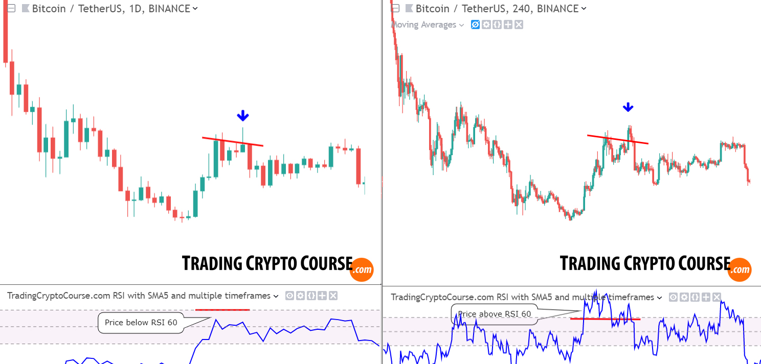
I always look at price structures on higher timeframes first, to get a good view on overall structures, so I know the dominant trend, and the major highs and lows. But on higher timeframe charts you get your entry signals a lot later. Often too late. This is because we want confirmation, by price breaking above AND CLOSING above the previous high. So I don’t use higher timeframes to find goos entries. On smaller timeframe charts you get more detailed chart structures and much more candlesticks, which is obviously better to get pinpoint precision entries. Below I show you the same chart as in the previous example, but I added a daily chart as comparison.
Two conclusions:
- What is immediately obvious to see, is that price doesn’t make a double-top structure with a higher high on the higher timeframe (left side). That higher high we saw on the shorter timeframe (right side at the blue arrow), is now just a wick (left side at the blue arrow). So the lower timeframe actually gave a better potential profit, if you sell on candle close 🙂 But I actually don’t like to use higher timeframes for trend, because htf often lag much more.
- That’s why I like to look at the RSI. As you can see: it failed to break above RSI60 on the higher timeframe in contrast to the lower timeframe. So this is a clear rejection of the reversal: definitely not an uptrend! This is why I like to use higher timeframes to confirm the momentum (1 of my 7 trading steps). In the next chapter I will delve deeper into this subject.
This is the end of the Chart Structures mini-course. I really hope it gave you a good oversight of what chart patterns are all about. Please look at these charts multiple times, so the wealth of information they contain can really open up and sink in.
Reading Chart structures is a skill that is essential for any Pro trader.
(I think one of the most important skills, because all trading indicators, MA’s etc. are derivatives from this)
Next, in part 2 of this chapter, I will touch on some supplemental topics regarding chart structures and patterns.