Renko Charts
I found out that by using a “Renko” chart, I can cut out a lot of noise on the chart. It also cleans up sideways indecisive periods. It cuts out the dimension of time in its entirety! Just look at this example, here you see 2 charts, an ordinary candlestick chart and a Renko chart. I often use a Renko chart to help me draw support and resistance levels:
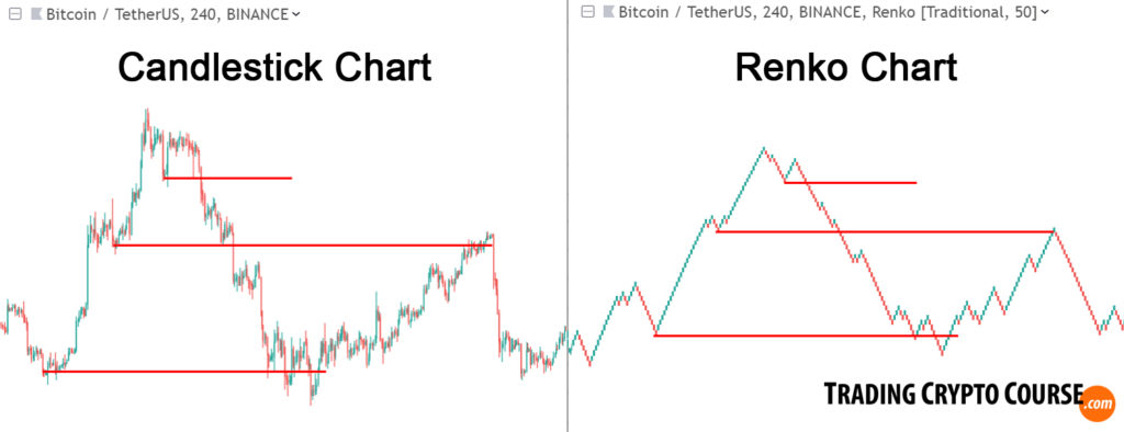
It works best on higher timeframes. And that’s why it’s also a lagging indication. So I use it primarily to quickly get the major highs and lows on the bigger scale.
Fake-outs and stop-hunting
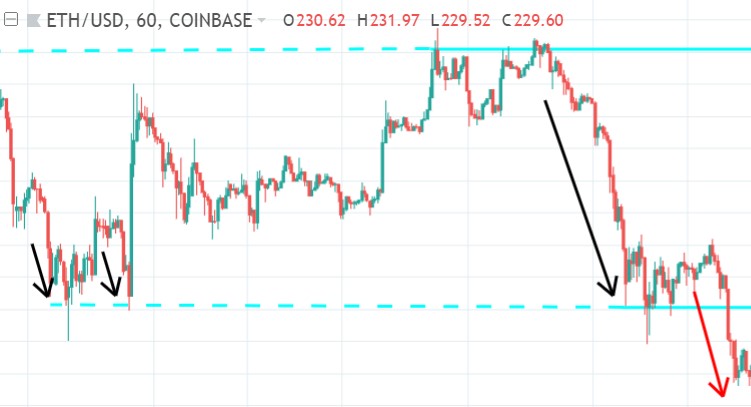
Often many (mostly retail) traders get stopped out, because they think a support is a specific price level, and thus put their stop-loss order right below it. Big traders often use this knowledge to stop out retail traders to get the big volume they need. This is called stop hunting. And the fake break-outs of those support (and resistance) lines are often called “fake-outs” or failure swings.
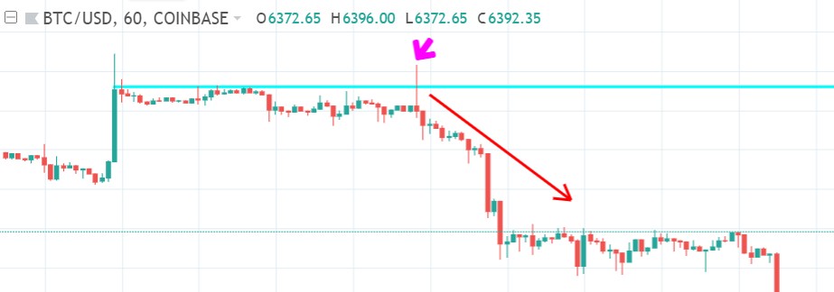
In the above image, the recent swing high is now a resistance level (blue line). At the arrow is the fake break-out. Above that resistance level retail trader place their buy orders (and the stop losses of their shorts). Big traders need that liquidity to get the volume they need to go short. So they trigger those buys and short them, and all those retail traders get stuck.

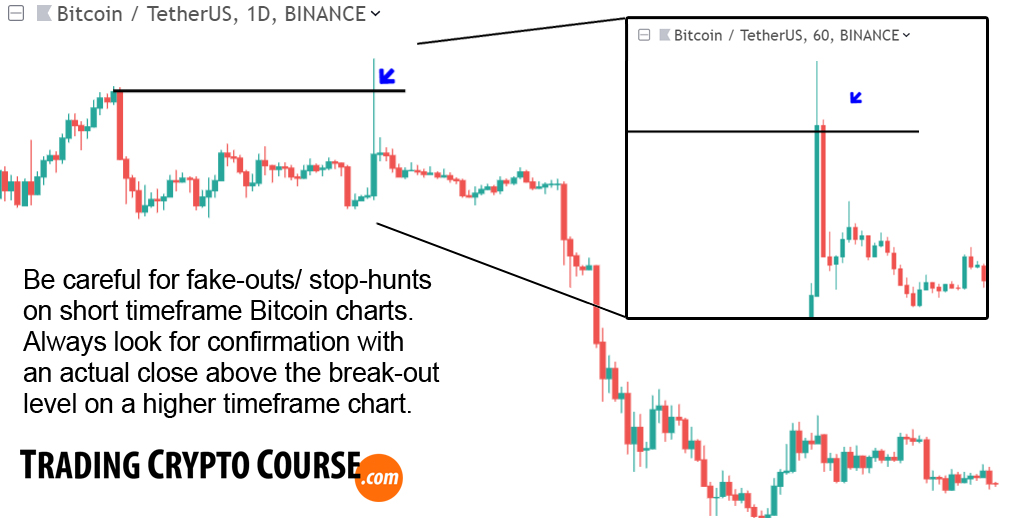
Always use higher timeframes on major swing highs and lows, to confirm that it is actually a real break-out:
Zones of support and resistance
Support and resistance levels are the cornerstones in all chart patterns. Most of the time supports and resistances are not exact lines, but more like zones. So even though I draw them as lines, I actually treat them as zones. Not everybody draws their lines at the same spot. And traders don’t place their bids and asks at the same spot either. It’s a typical beginner’s mistake to look at S/R levels as precise lines.
When I buy retracements, I want to buy as close to a support level as possible. Because a support is a level proven to be difficult to break. So chances are higher price will remain above it. Support levels can be:
- previous swing lows
- round prices
- important MA’s
- previous swing high – a previous resistance
That’s good to know, a previous resistance level, once broken, often turns into a support level. This is called a “support-resistance reversal” and is very common:
Support-resistance reversals
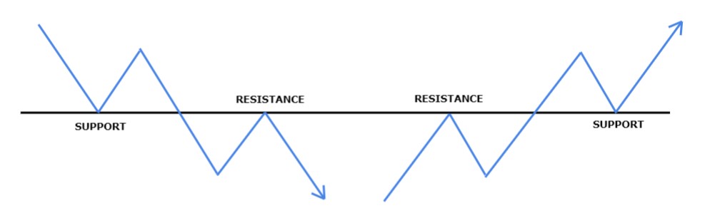
These role reversal scenario’s are very common actually.
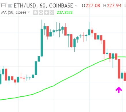
Moving average as support
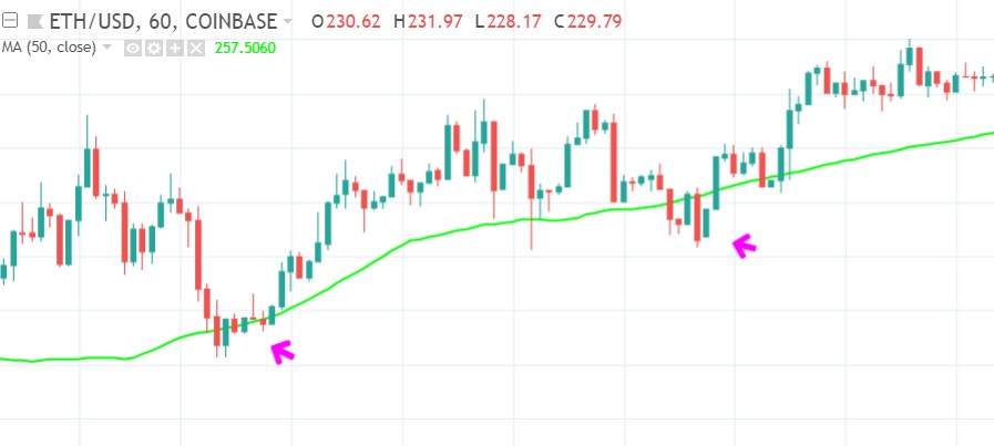
The moving average I am most interested in is the SMA50 level. As explained in chapter 1 the SMA50 acts as an important support in an uptrend:
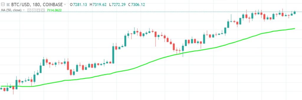
Here you see a SMA50 (green line), at the 1st arrow it still acts as support, next price breaks below it, and at 2nd arrow it is retested and holds as resistance:

This also illustrates that it’s not really an exact line, but a zone. You see, when price tests the SMA50 as support, it also probes below it. And when price tests it as resistance, it also probes above it.
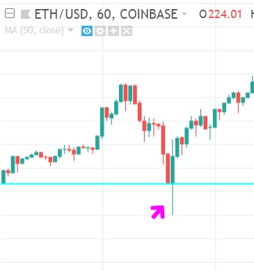
Everytime my 7 independent signals line up to make a trade, I always look how close price actually has retraced relative to the SMA50. I have experienced that the entries closer to the uptrending SMA50 or even below it (my favorite setup), have a very high success-rate. The entries that are further above the uptrending SMA50 have a lower success-rate, but a higher potential reward. But I have experienced that those higher entries can yet make another drop, forming a complex (ABC) retrace and end up closer to the SMA50 after all. So that makes those higher entries more dangerous, here is an example:
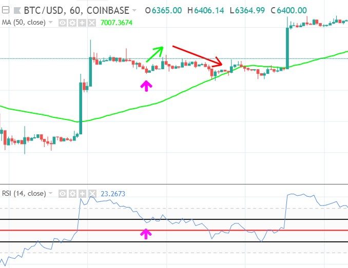
- Price is uptrending (upsloping SMA50)
- It is early in the trend (first wave up)
- There is bullish momentum (RSI returned from >60 and is still >40)
Everything looks good. But price fails to make a bounce up and moves sideways and towards the SMA50. That’s it! Support was still missing to back up the entry. After price reached the SMA50 zone it did make a big bounce.
Psychological barrier
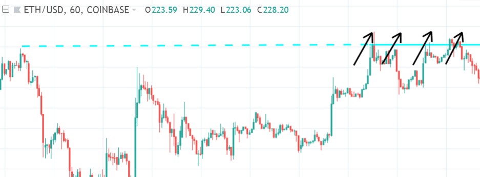
When price moves away from such a failed attempt, it often drops down to a previous support level:
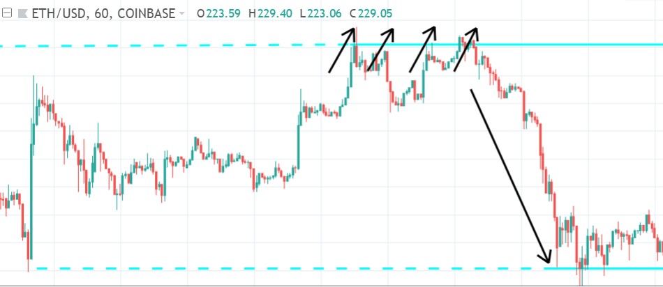
But the psychological barier works best, when those 3 tests happen in a short period of time (as in the above example), because traders:
- better remember all those subsequent tests
- and can see all the tests at once on their chart
When there is a longer period of time between those tests, there is a higher probability that it will be broken, as also happened in the same example:
Now you know how important support/ resistance zones are, and how they behave. You need a major support level below your buy, so the probability of price bouncing up is statistically higher.
Candlesticks and supports and resistances
People often ask where to put the support and resistance lines, below the bottom of the candle body, or below the candle low? Often you filter out more noise when you put it at the bottom of the candle body. But sometimes that filters out too much. Then you better incorporate both (the low and bottom of the body) into a bigger support/ resistance zone.

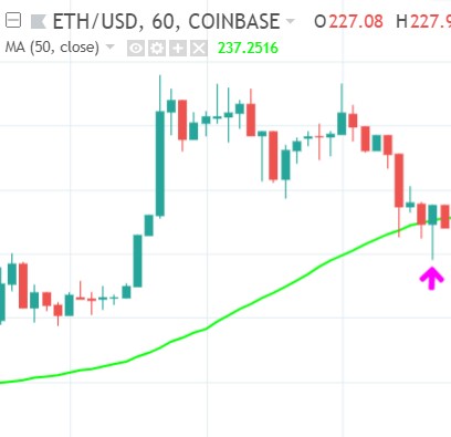
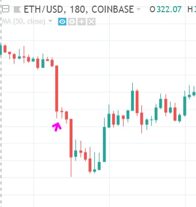
Often price probes a little bit beneath a support level, but bounces back up later on, respecting the same support. How do you know if a support level like the SMA50 will be respected, though price is a little bit beneath it already? Remember these levels aren’t static lines, but are more like zones. This is also true for the SMA50:
Btw. the above example also shows my favorite setup, the mean-reversion setup.
I consider the close of the candles that break support as the actual support level (but not the highs or lows). So candles that break below the support level, but still touch it, haven’t really broken it yet in my experience. They are still a part of the support zone:
The image above is an example with MA50 as a dynamic support level. Here I have another example with a “normal” support level:
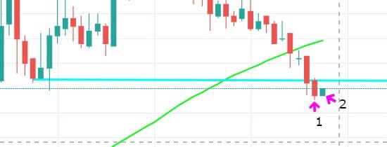
- Candle 1 still touches the support line. This means support is not really broken.
- Candle 2’s body is entirely within the range of candle 1: “inside-bar” pattern. This also means that the support is not yet broken!
So for me a support is broken:
- When a candle is below a support level and doesn’t touch it.
- When a candle’s body isn’t inside the range of the previous candle that still touched the support (inside-bar pattern)
For me the above example illustrates a broken support level.
The long red candle at the arrow:
- doesn’t touch the support line
- isn’t contained within the range of the previous candle that did touch the support line
Candlebar shapes and patterns are a really useful trading tool. I have a free lesson about candlesticks and candlestick patterns.
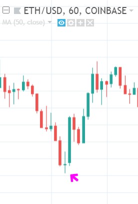
When a support level holds, I often see price making a probe below it, but getting rejected: price fails to stay below it. This is a clear bullish signal: the buyers have won the battle.
Another interesting candle is a “doji” candle, that signals indecisiveness. You often see this when at a support level price hesitates for a moment before breaking it.
Sometimes these are called half-masts.
Especially when the doji is part of a flag or pennant pattern. The first and second leg down are often similar in size.
But you also see doji’s when the support level does hold and price gets rejected:
With the above examples I tried to show that doji candles, can be found at both a broken support and at a support level that holds. So not really a distinct signal. For me another thing to keep in mind with candles is, that they render differently on different timeframes.
Obviously many traders use these candlestick patterns, and expect them to behave in a certain way and they trade accordingly. This creates a self-fulfilling effect that can’t be denied. But I would never trade on this signal alone.
SMA50 and EMA15
As I said above, moving averages act as support and resistances. The fast EMA15 often acts as support in a strong uptrend, and when this zone is broken price falls back to the SMA50 below it. When the EMA15 and SMA50 converge they form a stronger support zone together, as illustrated below

After the first break below EMA15 (green arrow) price already lost downward momentum before it reached the SMA50. Sellers got exhausted. But when EMA15 and SMA50 converge (as is shown at the blue arrow) a break below this support zone requires more strength. As long as the EMA15 is above the SMA50 this is a very strong support, when the EMA breaks below the SMA the support zone loses much strength (in case of a short trade this is vice versa ). Even the big red candle wasn’t strong enough to actually break it:
- price wasn’t able to pull the EMA15 below the SMA50
- price never lost touch of the SMA50 line
You see EMA15 and SMA50 converge and cross at the beginning and end of a trend. Their combined strength plays a big role in the formation of trends.
In the example below I try to illustrate how this works:

(Price action = grey, EMA15 = orange, SMA50 = green, regular supports = red)
SMA100 and SMA200
Next to the SMA50, I also use the SMA100 and SMA200 on my charts. Because the SMA100 and SMA200 on a 1 hour chart are equal to the SMA50 on a 2 and 4 hour chart respectively. Besides that many traders consider the SMA100 and 200 as very important supports and resistances, and always keep an eye on them.
Below a chart example with the SMA50, SMA100 and SMA200 on it:

(SMA50 = green, SMA100 = black, SMA200 = grey)
At the blue arrows price interact with the SMA100 and the SMA200 as support and resistance.
But more about the SMA50, SMA100 and SMA200 in the next chapter about higher timeframes, and also in the bonus chapter about my favorite mean-reversion trades.
I saved the best for last. When studying chart structures, you can’t skip the magic “Golden Pocket”. Interested? I’ll see you in the next chapter: