In Chapter 2 I used volume to determine momentum, the strength in the market. Now I will look at volume as another tool to time our entry. To do this we will focus on the depth chart. The depth chart is a tool that gives you a live visualization of supply and demand.
I already talked about supply and demand earlier. Depth chart is a tool to simply show you supply and demand per price level.

It is a visual representation of the orderbook. You see 2 colored lines, with colored zones beneath it.
- The red zone represents all the sell orders, the asks.
- The green zone represents all the buy orders, the bids.
The height of the line at each price level, represents the volume of the orders at that level, and can be read from the y-axis (vertical axis). The price levels can be read from the x-axis.
The Depth chart is cumulative. Let me explain with an example:
If Alice bids 1 at $6450 and Bob bids 1 at $6440, the total bids displayed at $6450 is 1 and at $6440 is 2 (because Alice is obviously also prepared to buy, if someone wants to sell at a lower price). So the Depth chart plots the bid prices along the x-axis on the left side, and at each price level it adds the bids from that level, to that of all the bids above that, and plots the total amount on the y-axis (green line). It also plots the ask prices along the x-axis, but on the right side. At each price level it adds the asks from that level, to that of all the asks below that. So if Alice asks 1 at $6460 and Bob asks 1 at $6470, the total asks displayed at $6460 is 1 and at $6470 is 2 (because Alice is obviously also prepared to sell, if someone wants to buy at a higher price).
When you open the depth chart (at your exchange), please move your cursor across the green part of the depth chart, it will display exactly the amount of BTC (the volume) you can sell per price level. And when you move your cursor across the red part, it will show you the exact amount you can buy at that level.
Now you know the depth chart basics. Now lets move one. How do you trade based on this chart? This comes down to psychology. The depth chart is a visual representation of the order book. Orders that are not yet executed (Look at the “Trade history” if you want to see actual trades). Orders in the orderbook and depth chart can be canceled, before they were ever executed. So it displays what people bid and ask per price level AT THIS MOMENT. So it doesn’t necessarily tell you what will happen in the near future. The next moment the orderbook can look totally different. So it only indicates the current sentiment among buyers and seller.
When using the depth chart I look at the middle zone. The outer zones are prices that aren’t really relevant at this moment and play little to no role what price will do next.
When timing my (long) entries, I look for bullishness to appear on the depth chart. If buy orders (demand) outweighs sell orders (supply), price might increase. Here I have an example of a depth chart that turned bullish:
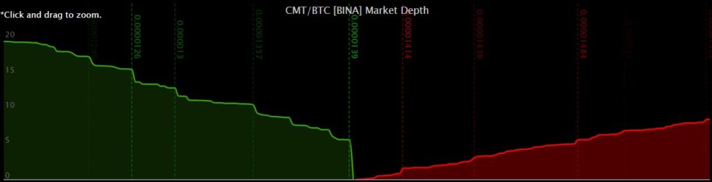
In front of the green area you see a “buy wall”, the more vertical part of the green line in the middle of the screen. This means that there is currently a lot of buying volume at that price.
Here is the key: it actually acts as a wall, making it difficult for the price action to go below it.
First these buy orders have to be executed, before dropping to lower buy orders. Often these buys eat away the thinner sell volume above it, resulting in a bounce upwards from that level.
On the opposite side a “sell wall” blocks price from going any higher, resulting in a drop down from that level.
So a “buy wall” makes price go up. BUT not always, because it has to be in front (like in the above example, in the middle of the chart). Be careful if there are smaller volumes in front of the buy wall, because often price actually drops first. It drops down to fill these orders, before it bounces upward off this “buy wall”.
This always reminds me of the bigger players that are stop-hunting the smaller players (like I explained before). Price first makes a small wick down (towards the big buy wall), eating the smaller orders in front of it first (sell and SL orders of many smaller traders), before it continues strongly in the opposite direction (after it bounced off the buy wall). The take-away is that although it’s true that a big wall drives price in the opposite direction, when there are smaller orders in front of the big wall, price often drops first to execute those, before it bounces off the bigger wall. If you already entered (on seeing the big wall), you might get stopped out (by this small move down), before the party even started.
The same is true if there is a big sell order in front, while there is a much bigger buy order, but only a little bit further from the front. Often the (actually smaller) sell wall will push price down towards the bigger buy wall. Next price goes up, eats through the sell wall and goes up beyond that.
Like in the next example, even though the buyers are more dominant, the fact that there is a larger sell order at the front makes price go down a bit first:
Btw. putting your orders on the same price level as these walls is a bad idea, because orders are executed first-in-first-out, and price could already be bouncing up even before your (last-in-line) order gets executed.
This is the exact same reason why market orders have “slippage”. While the order is being executed, price moves away, and the order is partially excuted for higher/ lower prices.
You also see this in very low-volume markets, where your own market order can be big enough to make price move away from you. And if your order is large enough, then you can also move prices in a particular direction in bigger markets. This is what “whales” do, and what market manipulation is all about.
So make sure you put your orders right in front of these walls, in case you are using limit orders and be very careful with market orders.
Sometimes one side of the depth chart almost completely vanishes, like this:
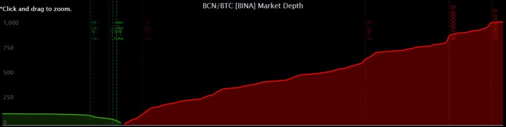
When you see a depth chart like this, it implies that all buyers are gone, and everybody wants to sell.
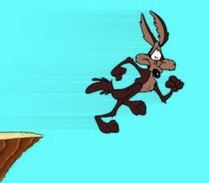
Often price does not immediately drop after support is gone. This always reminds me of Willy E. Coyote hanging in the air, before the lack of support beneath his feet actually makes him drop down.
A big problem is that big players try to manipulate the market by placing large orders, called “fake walls”, to manipulate the direction of the market to their own advantage. These walls are gone just as fast as they appeared. So be aware that a depth chart that looks bullish, can look bearish the next moment.
I don’t rely to heavily on buy walls, but look at the depth chart at the moment I like to enter, to get an indication (by comparing the buy orders and sell orders visually) whether the price will most likely move up or down. As a rule of thumb — if buy orders outweigh sell orders, price might increase. And as said before, order books can change in seconds and present a completely different picture.
How to see the difference between a real wall and a fake wall?
It is not that hard. Try to look at depth charts for some days and you will notice different patterns between price action and the depth chart:
- Fake walls often appear instantaneously, out of nowhere, and disappear just as easy. Real walls evolve more naturally. They’re build out of much more individual orders and take some time to grow.
- Often these fake walls are disproportionate. They are at a very tight price level, not spread out like normal orders. Real walls blend in better with the rest of the orderbook and are part of a larger dominant side of the depth chart.
To summarize the previous step:
On the depth chart I look for buyers dominance, especially in the middle part of the chart, as this has the most potential influence on current price. Watch out for “fake walls”.
In the next chapter I will take a more in depth look at orderbook analysis.
Click on the next button to go to the chapter 6.2: Advanced Orderbook Analysis