5.5: Technical Analysis: Candlesticks

Trading without any technical indicator, also called “naked trading”, means that you can see in real time what is going on with current price without the “mess” of indicators, moving averages, etc. It is better known as “price action” trading, where you trade candlestick patterns or even singular candlestick shapes.  I am a firm believer in indicators, provided that they are used in a significant manner.

I think it is important to know that indicators are all derivatives of price action, and therefore I think it’s important for traders to be able to understand “naked” price action.

  • In this lesson I will elaborate on individual candle shapes
  • In the next lesson I will show you common candlestick patterns

Candlesticks provide us with a reliable visual representation of what is going on in the market. Why is a candlestick chart better than a line chart:

  • A line chart only shows you the close price per period
  • A candlestick shows you the open, high, low and close prices per period

Here you see a visual comparison between a normal line chart and a candlestick chart:

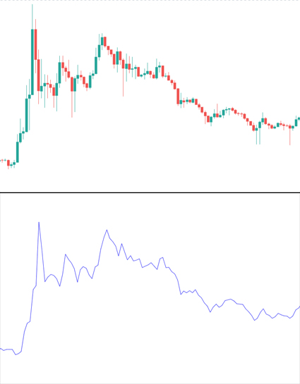
As is obvious to see, the candlestick chart seems to convey a lot more information in the same time period.

Candlesticks can be used alone, but most traders use it in combination with other technical analysis tools such as moving averages, momentum indicators, support and resistance levels, trend lines, etc.

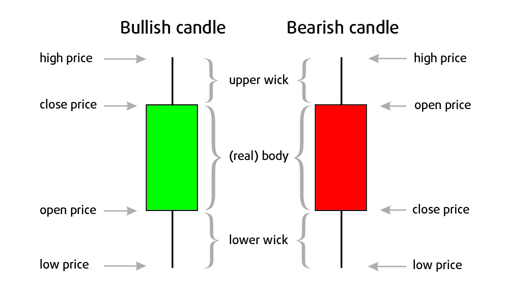
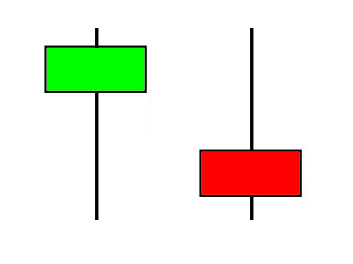
As said earlier candlesticks consist of the open, high, low and close of a chosen time frame. 

Here I show you the anatomy of candlesticks:

  • Bullish candlestick: A candle closes above its opening price. It means the market went up in this time period. 
  • Bearish candlestick: When it closes below its opening price. The market moved down in this period. 

Candlesticks are often colored to give more depth to their meaning. Bullish candles are often colored with green or white bodies, and bearish candles often have red or black bodies. The timeframe of the chart determines what time period 1 candle represents. For example, on a 15 minute chart, each candle represents a 15 minute period.

  • A long candle shape means price made a big move in a particular direction, AND stayed there. It confirms bullish/ bearish strength (momentum). 
  • A short candle on the other hand, shows us that price didn’t move a lot. It shows us that buyers and sellers are not active.
  • The upper wicks represent the high of the period. 
  • The lower wicks represent the low of the period. 

The wicks are sometimes also called “shadows” or “tails”. Long wicks show us that price action moved well above or below the open and close price of the period.

In this example, the left candle shows you that the sellers pushed the price way lower, but failed to keep it low, as buyers bought the price back up. The right candle shows us the opposite, buying pressure pushed the price way higher, as buyers were bidding higher and higher, but buyers weren’t able to sustain this level, subsequently sellers pushed the price lower again. 

These candles are often called “probes”, as these wicks often probe through support and resistance levels, and fail to break out as they again close below those levels.

In the next lesson I will show you how these candlesticks combine to form candlestick patterns, and how you can read them. 

Or Enroll in the Pro Course & Become a Pro Trader!

The #1 Crypto Trading Course.
Learn How To Profit Today!