5.4: Technical Analysis: Chart Patterns

Pattern recognition plays an important role in trading. Traders look for unique patterns on charts in order to find good opportunities. 

Often the biggest problem is you can draw an endless number of patterns on a chart. You will get an information overload. Maybe this would be nice as a piece of art, but it’s NOT really useful as trading tool. 

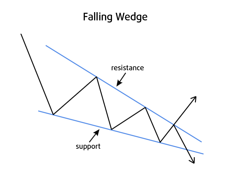
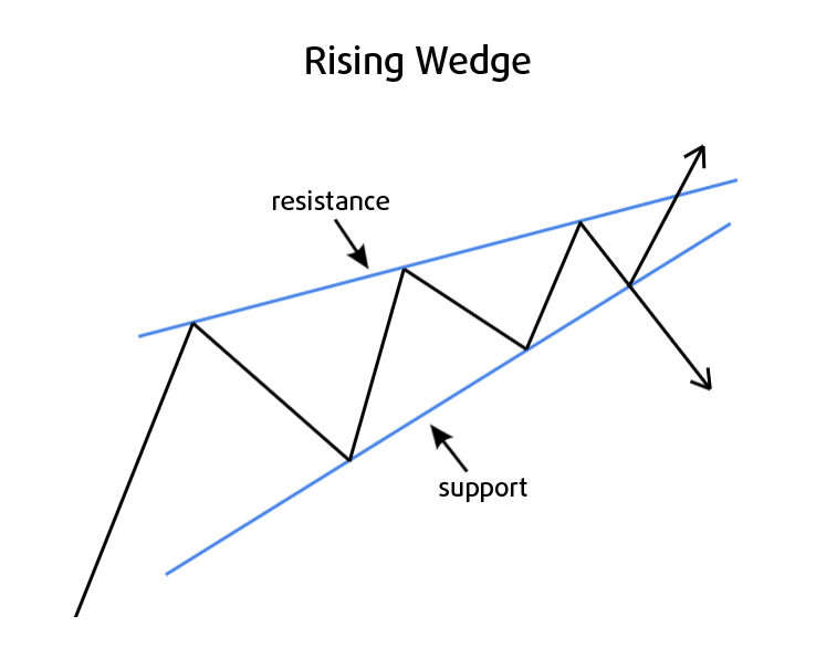
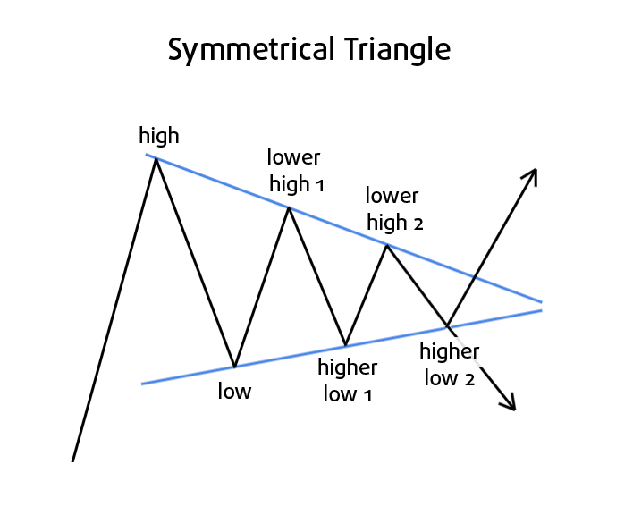
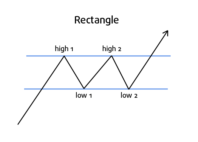
First determine what kind of patterns you’d like to trade. The majority of chart patterns fall into two categories: 

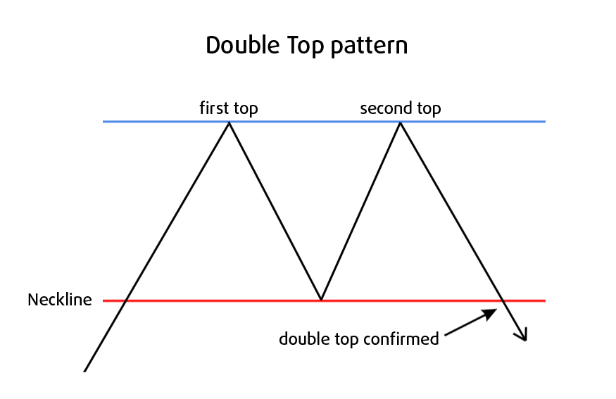
  • Reversal patterns indicate a change of trend and can be broken down into top and bottom patterns.
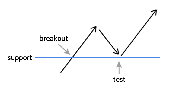
  • Continuation patterns indicate a pause in trend and indicate that the previous direction will resume after a period of time.

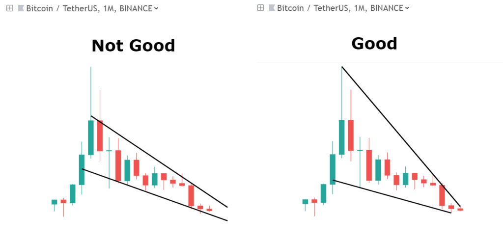
I don’t rely heavily on all of these patterns in my strategy, but it is very important to know they exist, as a lot of traders look at these patterns, recognize them, and trade based off of them. The self-fulfilling quality of patterns on charts can’t be ignored.

But price can do whatever it wants, and doesn’t need to obey what a patterns says. Many patterns are ambiguous and can be classified as both reversal and continuation pattern. Price depends on a lot of variables, so it often doesn’t behave as predictable as many traders would like. That’s why I look at price and the chart from 7 different perspectives, that are independent from each other. To get the best view on a trade and only make trades with the highest probabilities. You will learn all about this system in my Pro course!

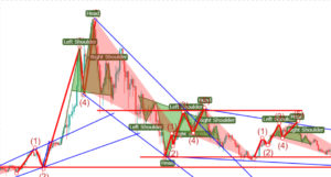
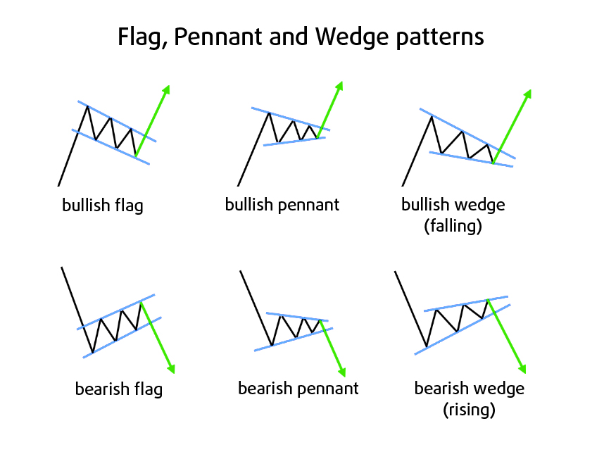
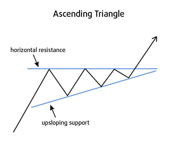
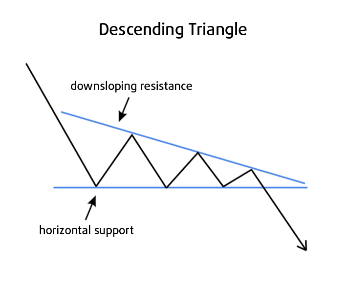
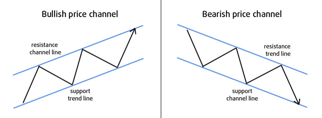
In this free lesson I will show you the most common reversal and continuation patterns and what they indicate.

Reversal Patterns

Double Top

The Double Top is a bearish reversal pattern. As its name implies, the pattern is made up of two consecutive tops that are roughly the same in size, with a small trough in between.

As is shown in the above image, the double top formation is confirmed when price breaks below the neckline after the second top. This neckline was previous support, and is now reversed to a possible reistance. So before going short or selling your long position, you should wait for confirmation of the double top. Wait for a a convincing break below the neckline, preferably confirmed by a rise in volume. Even more conservative is to wait for support-turned-resistance to hold when price tests it for the first time, that is what I prefer, it look like this:

So at the (re)test you have a saver entry opportunity, but price doesn’t always test a support or resistance after breaking it, so be careful.


Double top? 🙂

Tripple Top

Next to the Double Top, there are also Triple Top (and Triple Bottom) patterns. These are basically the same, but as its name implies, it has 3 tops instead of 2:

Double Bottom

The Double Bottom is a bullish reversal pattern. As its name implies, the pattern is made up of two consecutive bottoms that are roughly the same in size, with a small peak in between.

As is shown in the above image, the double bottom formation is confirmed when price breaks out above the neckline after the second bottom. This neckline was previous resistance, and is now reversed to a possible support. So before going long or closing your short position, you should wait for confirmation of the double bottom. Wait for a a strong break above the neckline, preferably confirmed by a rise in volume. Even more conservative is to wait for resistance-turned-support to hold when price tests it for the first time. But price doesn’t always test support when breaking above it, so be careful.

Head and Shoulders

A Head and Shoulders pattern forms after an uptrend, and it indicates trend reversal. The pattern is easily recognizable by its three successive tops, the middle top or the head being the highest and the two outside tops or shoulders, being lower and roughly the same in size. The lows can be connected to form a neckline that acts as support. This support doesn’t have to be horizontal, but can be diagonal, like a trendline. The neckline has the same function as in the Double Top pattern.

chartpattern3

In essence head-and-shoulders consists of just 3 steps

  1. price making a (final) higher high
  2. then failing to make another higher high, closing below the previous high (right shoulder). 
  3. Next it drops below the neckline, it also makes a lower low, confirming the end of the uptrend. 

The slope of the neckline is also an important indicator.

  • If the neckline slopes down, this signals bearishness, as price in fact already made a lower low prior to the right shoulder. 
  • An upsloping neckline indicates bullish potential. 

I see the Head and Shoulders pattern very often. But again, when entering or exiting the market one should rely on more than chart patterns alone. It is the meaningful combination of independent tools that gives you the most reliable signals.

Important lesson: often during the “left shoulder” the volume and momentum are bigger than during the “head”, even though the head makes a higher high. This divergence gives us an early signal that the head probably is the highest high, and we can expect a lower right shoulder next, confirming the head-and-shoulder pattern.

Reversed Head and Shoulders

The reversed head-and-shoulders is an opposite pattern that forms after a downtrend and signals a possible reversal to the upside. It is a very successful bullish chart pattern, consisting of three swing lows. 
It has a very high probability. 
This pattern is confirmed by a break above the neckline.

Falling Wedge

A Falling Wedge pattern consists of two downsloping trendlines that form a resistance line and a support line:

As the lines slope down, price makes lower highs and lower lows, indicating bearishness. The two lines converge as buyers and sellers come closer together. The lower support line is less steep, indicating the lows are getting less low and downward momentum is decreasing. 

This is why a Falling Wedge is generally regarded as a bullish pattern.
But in my experience a Falling Wedge pattern can occur before both a trend reversal and continuation. 

  • A bullish breakout is confirmed by a close above the resistance. Conservative traders wait for the more reliable signal when price test the resistance as support and it holds. 
  • A bearish breakout is confirmed when price breaks below support and it subsequently holds as resistance as price tests it. 

For a breakout to be reliable it should also be confirmed by increasing volume. 

The Rising Wedge is the exact opposite pattern and is a generally seen as a bearish signal. But in my experience it can also be a bullish signal.

Neutral Patterns

Symmetrical Triangle

Symmetrical triangles can be both a reversal and a continuation pattern. 

The pattern must at least consist of:

  • two lower highs 
  • two higher lows

So it basically looks like this:

The difference between a pennant (a pattern that also slopes horizontal – read below) and a symmetrical triangle, besides the fact that the pennant is normally a continuation pattern and the symmetrical triangle could be both a reversal and continuation pattern, is:

  • a pennant can be formed by 3 or 4 individual candlesticks only
  • a symmetrical triangle needs more than that (as you see in the above image). 

Another difference is that pennants (flags as well) are more common during explosive price spikes, occurring in the middle of the move, and are considered “half masts”To me pennants are in essence short symmetrical triangles.

Breakout

An important characteristic of chart patterns, which also applies to symmetrical triangles, is that the direction of the next major move can only be determined after a valid breakout.

breakout

As the triangle extends, price consolidates, and the triangle gets narrower, you should see volume start to decrease (the quiet before the storm).
But what is a valid breakout? 

A valid breakout is confirmed by an increase in volume at the same time. 

The direction can’t be determined before the breakout, don’t try to do this anyway, as it is very dangerous and unpredictable. There are also “false breakouts”, where price spikes out of the triangle but only to fall back into it later. 

That’s why I prefer to wait for valid breakouts by only trading conservative entries, which means after a successful test of the previous resistance as support:

Rectangle

A rectangle is a trading range that acts as a pause in the trend. It is often called a continuation pattern, as most of the times the trend continues after a rectangle. Although it is widely known as a continuation pattern, in my experience it is neutral. 

I also come accross it quite often as reversal pattern at the top and bottom of trends. The pattern is easily identifiable by two equal highs and two equal lows that are connected to form the parallel resistance and support lines, respectively the top and bottom lines of the triangle.

  • Near support buyers push the price back up
  • near resistance sellers push the price back down

These are called trading ranges, and are areas where price consolidates. As with most patterns, the end is characterized by a break out of the pattern. Volume doesn’t always decrease during the development of a rectangle though, as we have seen with other patterns. Sometimes it just fluctuates. But it is always best to look for breakout confirmed by an increase in volume.

Continuation Patterns

Flag and Pennant (and Wedge)

As said, Wedges can signal both a reversal and a continuation. They look a lot like the Flag and Pennant chart patterns. Though Flags and Pennants are considered to be only continuation patterns.  So all 3 can be considered continuation patterns. To make the difference between these 3 continuation patterns clear I made this visual comparison:

These are all continuation patterns that show a small consolidation before the previous trend is resumed. Important to notice that these continuation patterns are almost always preceded by a big price jump or drop and look like a pause in the middle of the run up or drop down. Without such a sharp initial advance or decline I wouldn’t consider it to be a reliable pattern actually. The sharp rise and drop in front of the pattern is often called the “flagpole”. The Flag and Wedge are usually sloping against the trend, the Pennant is usually sloping neutral. Again a breakout of the pattern signals a trend continuation (or sometimes a trend reversal in case of the Wedge).

Ascending Triangle

The ascending triangle is a bullish pattern that usually forms as a continuation pattern in an uptrend.
Sometimes ascending triangles act as a reversal pattern at the end of a downtrend. But they are generally known as continuation patterns. 

The pattern shows us that momentum is building up, pushing against the resistance, as support is making higher lows. Resistance keeps sloping horizontally, as it makes equal highs. The upsloping support line consists of a minimum of 2 lows, the horizontal reistance consists of a minimum of 2 highs.

Similar to the symmetrical triangle, the ascending triangle also shows volume decreasing as the triangle develops. A breakout should also be confirmed by an increase of volume in order to have a high probability.
Compared to the symmetrical triangle, that was more neutral, the ascending triangle is a true bullish pattern. Often the horizontal resistance is caused by some big sell orders at that level, but as the pattern indicates, buying pressure is building up. Once it “eats” through the sell wall, often the only way is up.

Descending Triangle

The descending triangle is the opposite of the ascending triangle pattern. Two equal lows make a horizontal support line, and two highs make up the downsloping resistance. It is a bearish continuation pattern, as price is making lower highs. This is what it looks like:

Volume also decreases while the triangle develops, and should increase when price breaks out of the triangle. While it is known to be a continuation pattern, sometimes it acts as a reversal pattern at the end of an uptrend. 

Price Channel

A price channel looks similar to the rectangle we discussed earlier. The difference is that a price channel slopes up or down and is a true continuation pattern. It consists of an upper trendline that acts as resistance and a lower trendline acting as support. 

  • Downsloping price channels are considered bearish 
  • Upsloping price channels are considered bullish
  • In a downtrend the resistance is the main trendline, the parallel support line is also called the channel line. 
  • In an uptrend, the support is the main trendline and the parallel resistance is called the channel line. 

Ideally the main trendline and the channel line are each based on 2 highs or 2 lows. In an uptrend, traders often want to buy near the support line, or sell near the resistance line.

Drawing Tips

Try to include as much wicks as possible when drawing your chart patterns:

Most experienced traders use logarithmic (“log”) charts. New traders often stick to the default “linear” charts.

The difference between a linear and logarithmic chart

  • A linear chart has a scale with units that have equidistance spacing between them. 
  • On a logarithmic scale the distance between the units is increasingly smaller. But 2 equal % changes have the same distance on the scale. For example:
    If price grows 100% from $10 to $20 (a $10 growth), then the space between these units is the same, as when price grows 100% from $50 to $100 (a $50 growth). 
    So instead of measuring the absolute change, it measures the % change.

Here in a more schematic form:

Final words

I am skeptical when traders solely use one piece of information, like chart patterns, in their trading method. I always look for meaningful confirmation by independent perspectives. I’m not particularly impressed by the usefulness of all these kind of chart patterns, unless they are used complementary to other independent analytical tools. 

As you have probably already seen, I use “candlestick” charts. In the next chapter I will tell you everything you need to know about candlesticks. 

Or Enroll in the Pro Course & Become a Pro Trader!

The #1 Crypto Trading Course.
Learn How To Profit Today!