Trend
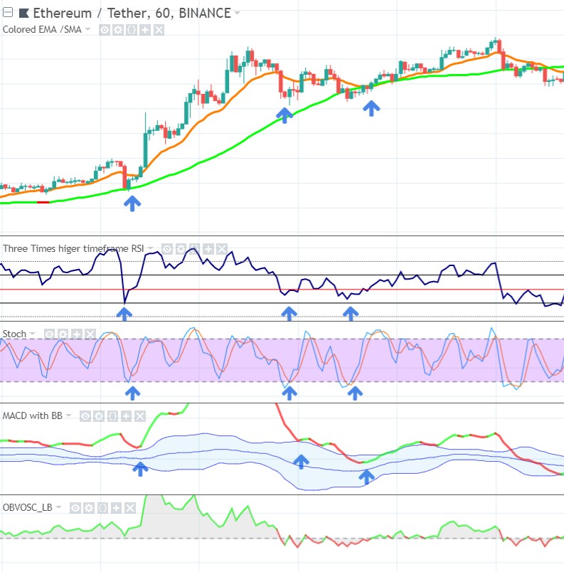
In the next example the upsloping SMA50 obviously indicates an uptrend. I have 3 possible entries, the first 2 are best, the 3rd entry (3rd blue arrow) I added to show you that when the space between EMA15 and SMA50 disappears this means that the trend lost strength. The further EMA15 is above SMA50, the stronger the trend.
Momentum
We want to buy at each of these cycle lows, as you see the RSI respects the 40 line each time, for momentum this is the support in an uptrend. So when RSI respects the 40 level as support, then it also confirms the continuation of the uptrend. Volume (obvosc: On Balance Volume oscillator) also looks bullish, never dropping really far below zero (the dashed line).
Chart Patterns
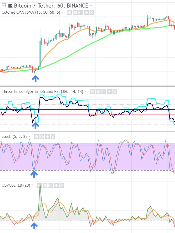
At the first entry opportunity (at the arrow), you see the SMA50 dynamic support line (green) and the horizontal support level (dark blue) converge. This leads to an extra strong support area/ zone:

This conjunction gives the most support compared to all the other support zones. Price bounces with strength off this zone. The distance between the higher EMA15 and lower SMA50 increases, indicating strength: we are in an early uptrend.
Later on you see it fails to break above a resistance zone, and falls back to a previous support, while also dropping below the EMA15, which coincides with RSI dropping below 60, and the uptrend losing momentum.
Next the EMA15 even pushes price back to the SMA50, as price is already ranging in a sideways trend (and RSI ranges between 40 and 60), as traders become indecisive and await what will happen next (will the trend continue or reverse).
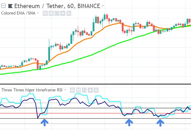
Higher Timeframe
On the higher timeframe chart the RSI also looks good. It isn’t dropping below 40 at the entry points:
Timing
The Stochastic gives a perfect timing on each entry. After it dropped below 20 it bounces back up above it, giving us an entry signal. At the first entry it just touches the 20 line and bounces off, also a perfect bullish entry signal.
Next I confirm the timing by looking at the MACD/BB. Here I see that all entries are confirmed, each time the MACD line bounces up just after the Stoch gave a signal, as said the MACD/BB is a bit lagging, but this saves us from bad entries. I prefer to see MACD bounce off a BB line, so I prefer the first two setups, because the second could more easily drop further down to a lower BB line. Best setups are where MACD bounces off or crosses up the lower BB line.
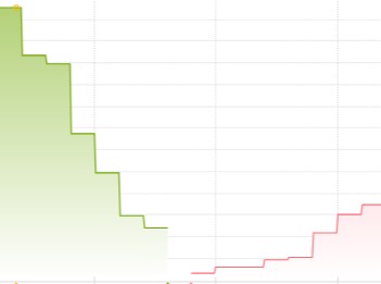
Depth Chart
Depth looks bullish at the first entry, confirming the picture we already have:
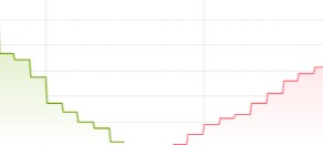
At the latter 2 entries it became slightly more indecisive, and the depth chart confirms the doubt the other indicators already gave us:
Bitcoin
Bitcoin confirmed the image I already had of my trade: that all the tools in my toolkit point in the same direction: BUY.
On a bigger scale Bitcoin was also looking bullish, as it was in calm waters for some time, moving up calmly and no major resistance zone up ahead.
By now we have looked at the many facets of a potential trade in minute detail. As you have seen, it is very important everything comes together, so it is important you have a coherent view of the whole spectrum of data. To make all the data easier to digest, and easier to compare, I will condense it down to a schematic format in the next examples.
This way you can immediately see if all 7 steps are lining up. So you get used to approach these 7 steps in a systematic and “simple” way. After all I like to Keep It Simple 🙂
The next examples will focus on the price charts, the KEY PART of my method. The depth chart and Bitcoin correlation are already covered extensively in the past chapters.
Click below for the next example.