Here I have made the first example, to show you how all these steps come together, and reinforce each other.
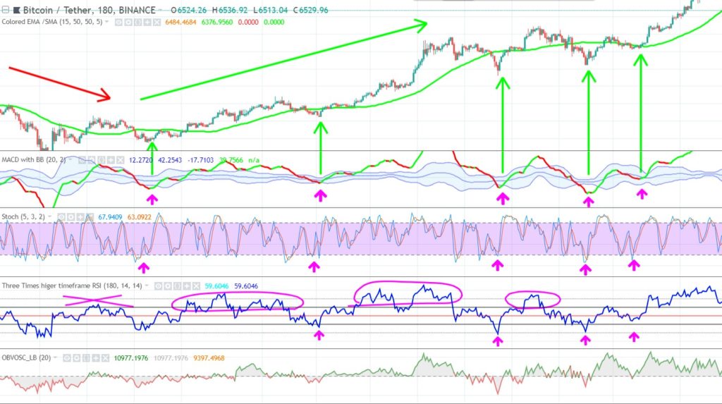
This is the BTC/USDT chart.
Trend
You see that at the left side of the chart, the SMA50 reverses and begins sloping upward. This signals us we are in a very early uptrend.
Momentum
- At the same time we see that RSI is not yet convincingly breaking above RSI 60. So still no strength to the upside at the first arrow. But at the second arrow, we see that RSI has already been above the RSI 60 level, confirming the uptrend we also saw on the upsloping SMA50, and RSI is testing and respecting RSI 40 level, that acts as a support in an uptrend.
- On the volume oscillator, I only look if volume is not too high at our entry. Because if it’s too high already at the bottom, it often has less volume left for a big upcycle. I want to avoid such an exhaustion pattern.
Chart Patterns
Support levels play a crucial role at each entry:
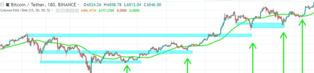
Next to that the SMA50 also acts as a dynamic support zone. In trends that are stronger (sloping up steeper) and where price moves further away from the SMA50, I often use the EMA15 as dynamic support line, but always look at the history of a chart to see if it respects it as a support (this applies to any MA I use).
Higher Timeframe
As said, I don’t look at trend on a higher timeframe, but at momentum. I illustrated this by adding a higher timeframe RSI to my RSI indicator (light blue line)
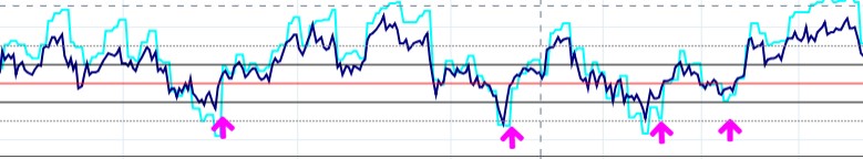
As you see, each time RSI respects its uptrend, by respecting the RSI 40, The higher timeframe RSI also makes a retracement up afterwards.
Timing
- At the same time that the RSI respects the RSI 40 support zone, we also get the timing signal from the Stochastic, as it crosses up its 20 level. But because Stochastic (and price) can often make a complex retrace/ double bottom (and drop even further down) I also check the Bollinger Bands on the MACD (MACD/BB).
- The MACD/BB needs to confirm the Stochastic signal: it should also reverse from downward to upward. Normally I don’t wait for the MACD to cross above the lower BB, only when I doubt. I illustrated this by giving the downward MACD a red color, and the upward MACD a green color. As you already know, it is a bit more lagging, but therefore a more reliable signal. MACD turns to green, and I wait a little bit to make sure it actually turned and it isn’t just random volatility.
Depth Chart
For each trade I took a quick look at the depth chart, and each time it showed me buyers already were bullish the moment I entered, like this:
Although this is more difficult to capture in an image. You need to monitor this constantly. What you want to see is buyers (or sellers) strength evolves naturally. So don’t panic buy into a trade, because all of a sudden a big buy order creates buyers dominance out of thin air. You need to have context. If buyers dominance evolves naturally while your other indicators were turning bullish also, that is a perfect confirmation.
Bitcoin Correlation
In this case I didn’t have to look at the Bitcoin chart, in order to make sure Bitcoins price action isn’t ruining my trade, because I was trading Bitcoin itself. You will find more examples with Bitcoin as extra confirmation hereafter.
This example was without the use of an EMA15, next examples will also include that, and it will become obvious why.
This was the first example, as you see it’s somewhat like NASA launching a rocket, and all systems have to give a go before take-off.
Click below for the next example.