Step 1: Determining Bases
Many QFL traders use tools that find the bases for them, tools like cryptobasescanner.com or qft.hodloo.com. But there are other ways to do this.
Of course there is nothing wrong with a little bit of manual chart reading, like Quickfingers Luc himself also did.
I think important bases are often easily recognizable on most charts. Moreover if a base is not recognizable with the naked eye, than other traders probably also don’t see it. In that case the strength of that base is probably less. Because supply and demand are mostly about crowd psychology, and charts have a self-fulfilling quality:
The more traders see a base ⇒ the more traders anticipate on it ⇒ the stronger the effect of that base will be.
I will get straight to the point. I found out that by using a “Renko” chart, I can cut out a lot of noise on the chart. It also cleans up sideways indecisive periods. It cuts out the dimension of time in its entirety! Just look at this example, here you see 2 charts, 1 ordinary candlestick chart and 1 Renko chart. I used the Renko chart to draw the bases:
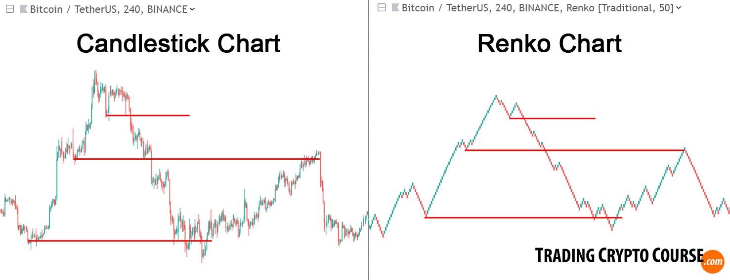
Nice isn’t it 🙂
I can already see that the top base is dangerous. Because price can fall a long way down, looking for support at the 2 previous bases. I alway advice to look at the bigger picture, zoom out and determine how low price could fall: Don’t trade bases that are too high from a historical perspective!
Step 2: Chart Structures
Many new QFL traders fail, because they tend to buy too close below a broken base. Luc often warns for this. In my opinion you should focus less on broken bases, and more on good entries. In fact bases can help you find entries and exits. First I look at basic chart structures.
This is what I actually prefer to see:
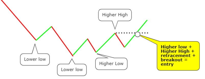
And if price makes a higher high before making a higher low, then this is what I prefer:
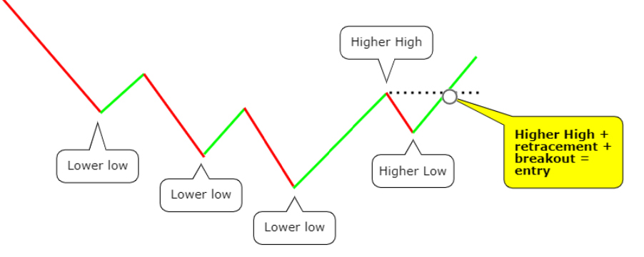
After the base-break and subsequent drop down, I want price to make a higher low, followed by a higher high, and next a confirmation of that higher high by breaking above it after a retracement (Like in the last example, the first higher low is not necessary though, as price sometimes breaks out very fast).
I now zoomed in from a 4h timeframe to a 1h timeframe, and have drawn the basic chart structures:
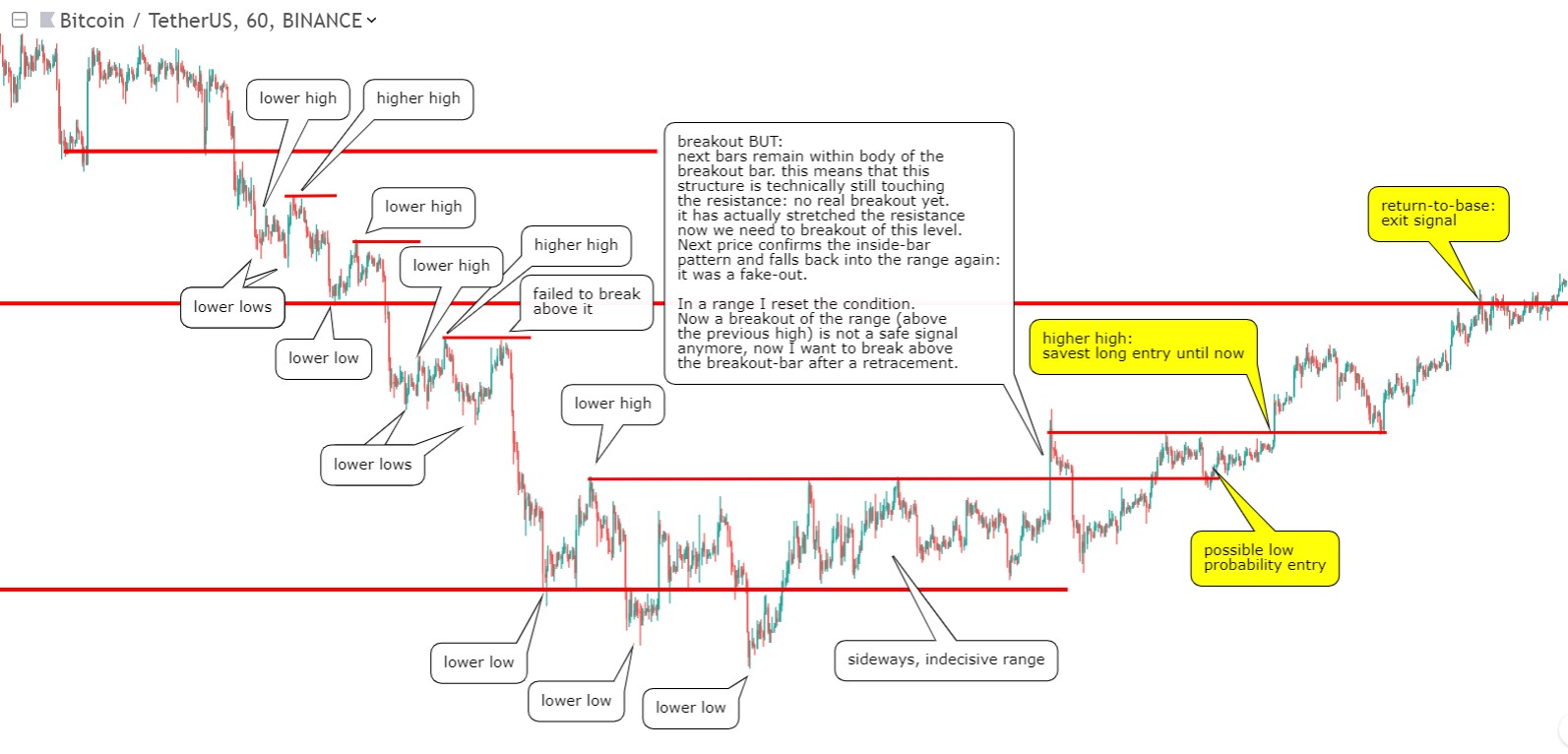
Below the 1st base it immediately becomes clear that the chart structure shows us no signs for reversal. There are some small retracements though, but since we are in a downtrend, since we broke this 1st base (creating a lower low and ending the previous uptrend), the chance that such a move upwards is a reversal has become smaller.
Even below the 2nd base there is no real reversal, but there is of course a retracement back up. But price didn’t manage to break above that high and turn it into a reversal unfortunately. So again below the 2nd base the chart structures also show us no signs of reversal.
Below the 3rd base, you see the same pattern repeated, price fails to make a higher high. Eventually it breaks out of the sideways channel, but it failed, because the next bars remained within the range of the breakout bar. So it was technically still touching the resistance. We want a clean break above it though. This failed breakout-bar structure even stretched the resistance a bit higher. Next we see price break out of the channel again, and eventually breaking above the now-stretched resistance. That is the first reliable long entry signal!
Next price respects its base, a clear exit signal 🙂
Don’t just look at bases (strong supports) alone, also look at previous resistances. They can again be respected as resistance, or in case of a “resistance-support flip”, now play a role as support level. In the next example you see previous resistances (blue lines), that later continue to play a role in the downtrend:

Learn how to read chart structures, it is where all trading tools and indicators depend upon. It can’t be denied! The Pro course has an in-depth Mini Course on reading chart structures like a pro.
Step 3: Moving Averages
That were the chart structures. The main ingredient of chart structures are strong support and resistance levels, especially “bases”. Next let’s look at moving averages. Moving averages actually act as dynamic support in an uptrend and as dynamic resistance in a downtrend. And as such they also play an important role in my version of QFL base-break trading. In the next example I have added the blue SMA50 (50 period simple moving average) and the red SMA100 lines to the same chart:
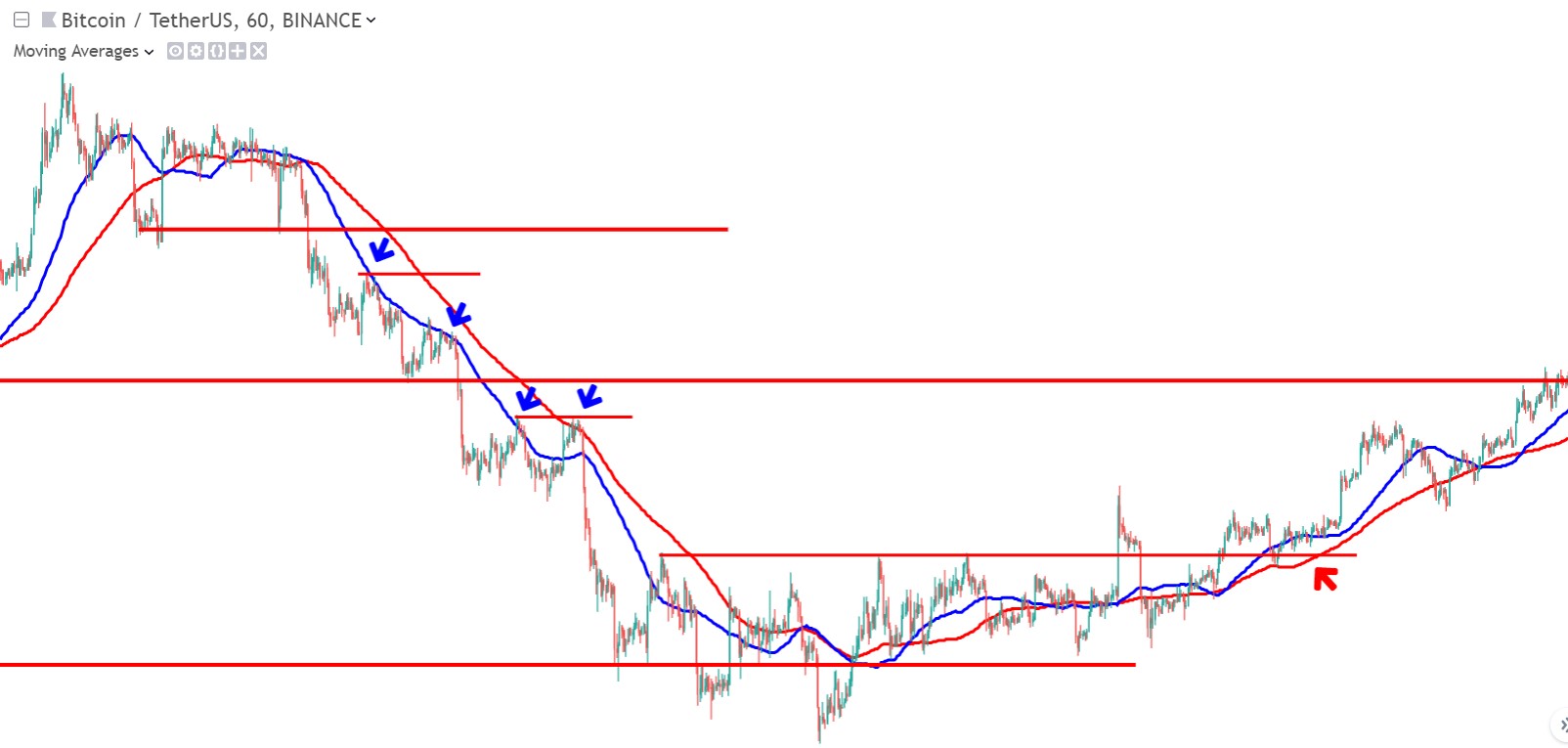
At the blue arrows you see that the (blue) SMA50 line constantly acts as resistance. In fact the reason that price didn’t manage to make a higher high each time is because of the SMA’s holding it back. When it does break above the SMA50 (below 2nd base), you see it runs into the (red) SMA100 line. It gets exhausted because of the SMA100, and next it fails to breakout and make a higher high, and makes a panic drop towards the lowest base.
At the red arrows you see that our entry signals came at the same moment that the SMA’s broke abve the channel’s resistance. You also see that the SMA50 is now above the SMA100: this confirms the uptrend. In a downtrend the SMA50 is mainly below the SMA100, and they both act as support levels instead.
Btw. it is also good to look at the SMA200, as bigger scale s/r level.
So these SMA’s are good for setting targets. I actually prefer to take profit below the SMA50. Often QFL traders complain that their bases aren’t respected at all. For those traders my advice would be that in QFL trading it often takes a lot of time for bases to be respected (patience is always good). If you want to trade faster, it is better to target these dynamic resistance lines, preferably below the SMA50, for taking profit.
Step 4: Indicators
The first indicator I will look at is a momentum indicator. I like to look at this for early reversal signals, called “divergences”. More about divergences in this lesson. Divergences are in fact the earliest signals I came across in Technical Analysis. So I always look for them when I am looking for entries. Here I have plotted them on the chart (magenta lines):
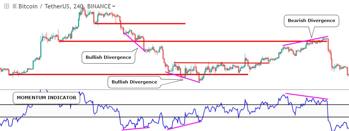
- The first bullish divergence, below the 1st base, showed me that bearishness was slowing down. But it didn’t result in a big retracement back to the base. NOW YOU KNOW WHY 🙂 because it ran into a previous resistance, and into the SMA50 resistance. On the above momentum indicator, you also see that the blue momentum ine is still below the lower black line. For a strong retracement or reversal it should even cross above the upper black line. Next price made a lower high: a bearish confirmation, that caused price to drop below the 2nd base.
- The second bullish divergence caused momentum to start ranging between the 2 black lines: a signal that the market is indecisive. Next price went sideways indeed.
- The final bearish divergence wa an actual exit signal. As you can see, it was spot-on! 🙂
- A break above the upper black momentum line was 1 of the confirmations that price made a reversal and the downtrend was over. But I actually have a couple more indicators:
I like to look at these indicators on a higher timeframe, in this case a 4h chart, so I can get htf confirmation on momentum, because sometimes that can save you from a bad trade (btw. it is not really useful to look at moving averages on a higher tf, because those are lagging indicators, and will only lag more on higher tf’s).
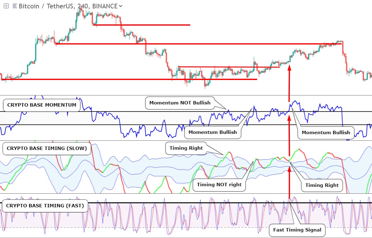
You see that the momentum indicator and the timing indicators, all gave a bullish signal, confirming the earlier entry signals from chart structures, s/r levels, and moving averages. We got confluence between all these independent indicators. In the Pro course you will learn how to use all these indicators and more!
Or Enroll in the Pro Course & Become a Pro Trader!