Trading with Indicators
Indicators, tools such as moving averages and MACD, are used by traders to analyze historical prices, predict future trends and provide trade signals.
The data that indicators use, is pure price-action. So any debate about which is better, price-action or indicators, is pure nonsense. I use them both, and so should you 🙂
Indicators are just tools that use mathematical formulas to metamorphose price-action into another visual form on a chart or oscillator. Indicators use the same open, close, high and low candlestick data that you see on the chart itself. Indicators are formulas that look for more complex relationships within the data, than most traders will get out of a chart.
There are basically 2 types of indicators,
- Trend
- Range-bound
Trend Indicators
With trend indicators you want to identify a trend, specifically you want to know:
- the beginning of a trend
- the strength of a trend
- the end of a trend
But how do you know the trend using only price-action?
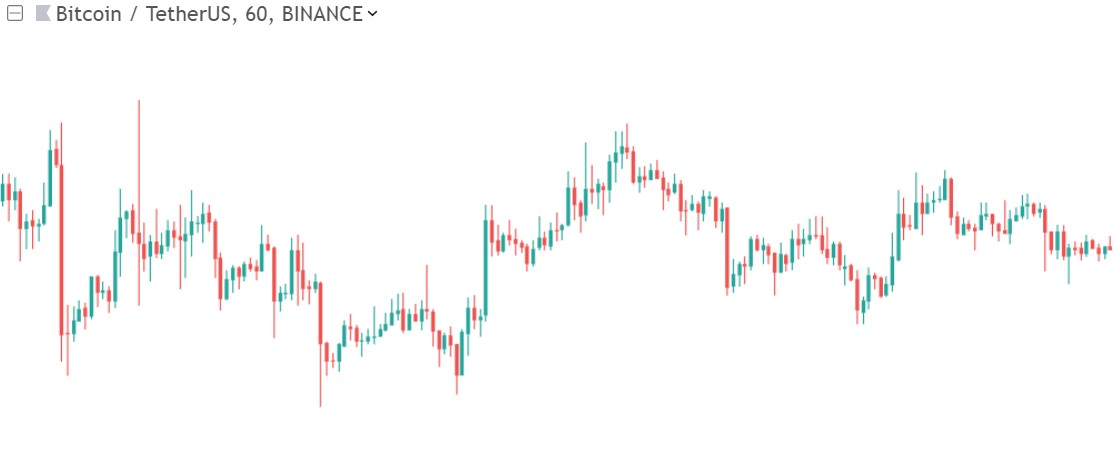
Below an example of ranging price action:
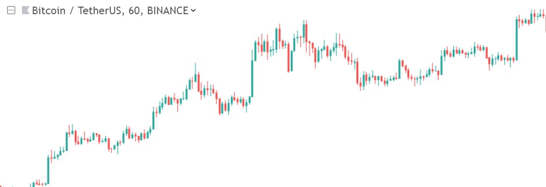
Below an example of uptrending price action:
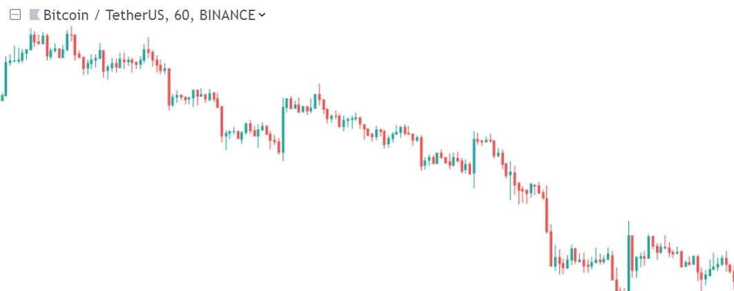
Below an example of downtrending price action:
As you can see in case of a sideways ranging market, this is not always “easy” to see on a naked chart.
So which indicators do we use to measure the trend?
Moving Averages
A moving average is an indicator (some people wrongly say it isn’t an indicator).
In the lesson about trendlines I already mentioned the use of moving averages as dynamic support and resistance lines in trends. In this lesson I will talk about moving averages from an trend-indicator point of view.
A moving average is plotted as a line on your chart. It is an average over a previous period. This makes it a “lagging” indicator. It works best in a trending market, hence it’s use as a trend-indicator.
- In an uptrend price is mainly above the MA.
- In a downtrend price in mainly below the MA.
- In uptrends MA slopes mainly upwards.
- In downtrends MA slopes mainly downwards.
- The longer the MA period, the longer the trend.
It is very important to know that the slope of the MA signals the momentum of the trend. The steeper the MA, the more strength the trend has. When price is above the MA this also signifies (upwards) strength, the higher above it, the more (upwards) strength (in a downtrend vice versa).
Below for example the longer 200 period SMA (Simple Moving Average) on a daily Bitcoin chart:
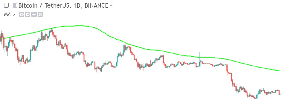
This is obviously a long-term downtrend. But if we shorten it to a 50 period SMA, and look at it on a 4 hour chart, we get this:
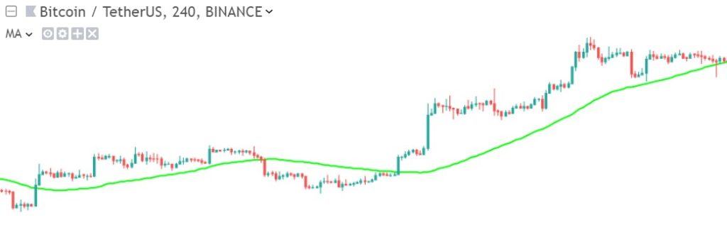
A short-term downtrend. So a longer period MA shows you trend over a longer period of time, the smaller trends often even disappear from it.
So using multiple MA’s we can determine the dominant long-term trend over the past months, and short-term trends that happened inbetween. So it is very important to look at timeframes when using MA’s to measure the trend.
You can also determine the strength of a trend using Simple MA’s.
- In a normal trend price mainly respects the SMA50 as support
- In a very strong trend price mainly respects the SMA200 as support
When trading with MA’s people often use the crossover rule:
- You buy when price crosses above the MA
- You sell when price crosses below the MA
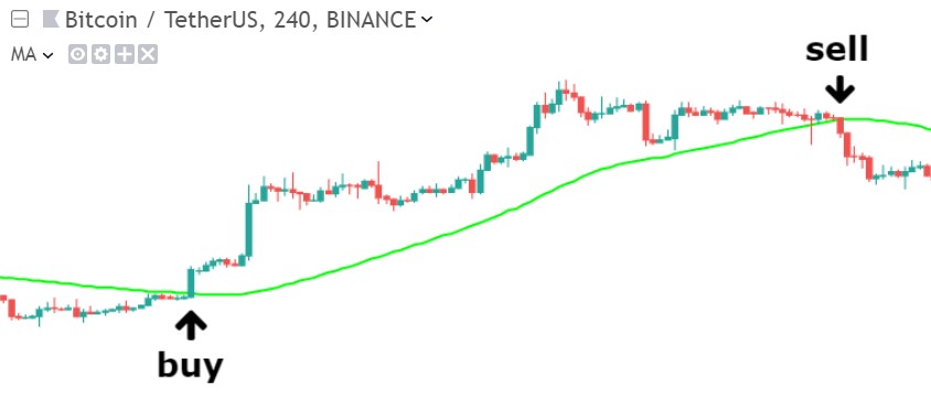
But in reality this is not a complete trading system at all. Often you get “whipsawed” (or “whipped”), when price makes a fake breakout. Whipsaw refers to price being “noisy”: price quickly moving up and down through the MA, a whipping action. In the volatile crypto markets this is very common. Unfortunately trends aren’t always as clear and clean as in the above example 🙁
What many traders do to protect themselves against whipsawing: they use the crossover rule, but instead of price to cross over a single MA, they use a shorter MA to cross the larger MA. This is the crossover rule for 2 MA’s:
- You buy when the shorter MA crosses above the longer MA
- You sell when the shorter MA crosses below the longer MA
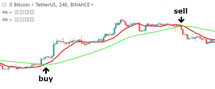
When applied to large timeframes, then these crossovers form major market reversal points, and are called:
- Golden Cross, a short term MA crosses over a long term MA
- Death Cross, a long term MA crosses under a short term MA
Usually these crossovers are made by the SMA50 crossing over the SMA100 or SMA200.
MACD
The MACD is a very popular indicator. It is a trend indictor (and is also used to measure momentum). As said this indicator is based upon the crossover of 2 moving averages. When you have a swing high in price, and traders are waiting for the MA’S to crossover they notice how price first converges to the faster MA, and next converges to the slower MA. By the time the MA’s crossover, the high has already passed. And after a crossover the opposite happens: the 2 MA’s diverge from eachother.
My conclusion:
- Convergence of the MA’s gives a leading signal that the trend is changing, before the actual crossover happens
- Divergence is a confirmation of the crossover, confirming the end of the trend, or new trend, after the crossover has already happened.
As you know, MA’s are lagging indicators (calculated over a previous period), so MACD is also lagging, as it is composed of 2 MA’s. Thus having an early confirmation (convergence) of the trend is very useful.
The MACD can work with any MA setting, but the default setting is a 26 and 12 period MA. The MACD line is made by subtracting the 26 period MA from the 12 period MA.
- If the line slopes down (distance between MA’s gets smaller), then the MA’s are converging.
- If the line slopes up (distance between MA’s gets bigger), then the MA’s are diverging.
- If the MACD line is at the zero line, then the MA’s crossover:
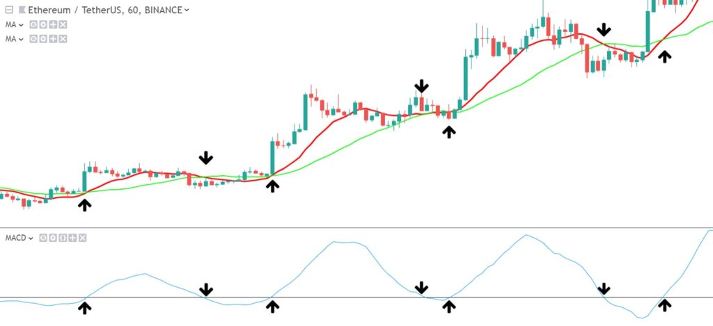
(red line = 12 period MA, green line = 26 period MA, blue line = MACD line)
Ok, so imagine you entered a long position. MACD line is going up. When do you exit? You want to anticipate the early signal of the converging MA’s. But when exactly? To make this less arbitrary and more rules-based, the inventor of the MACD added a trigger, a 9 period MA, based on the MACD line itself. So when this trigger-MA crosses below the MACD line, then you have your exit signal:
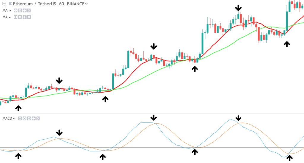
(added the red line in the MACD = 9 period signal line)
Most people use this crossover signal, but have no idea how to read the MACD any other way. That’s a shame, as the MACD has much more to offer: the Histogram.
The Histogram doesn’t have a clear trigger as we saw above. But it gives you more freedom in interpretation. The 9 period crossover trigger was a rule based system. The histogram is more of a discretionary system. You have to “eyeball” the chart and take conclusions on the patterns you recognize. But often it gives you something AMAZING in return: Although the histogram doesn’t give a distinct trigger, it has even more predictive properties, if you learn how to read it:
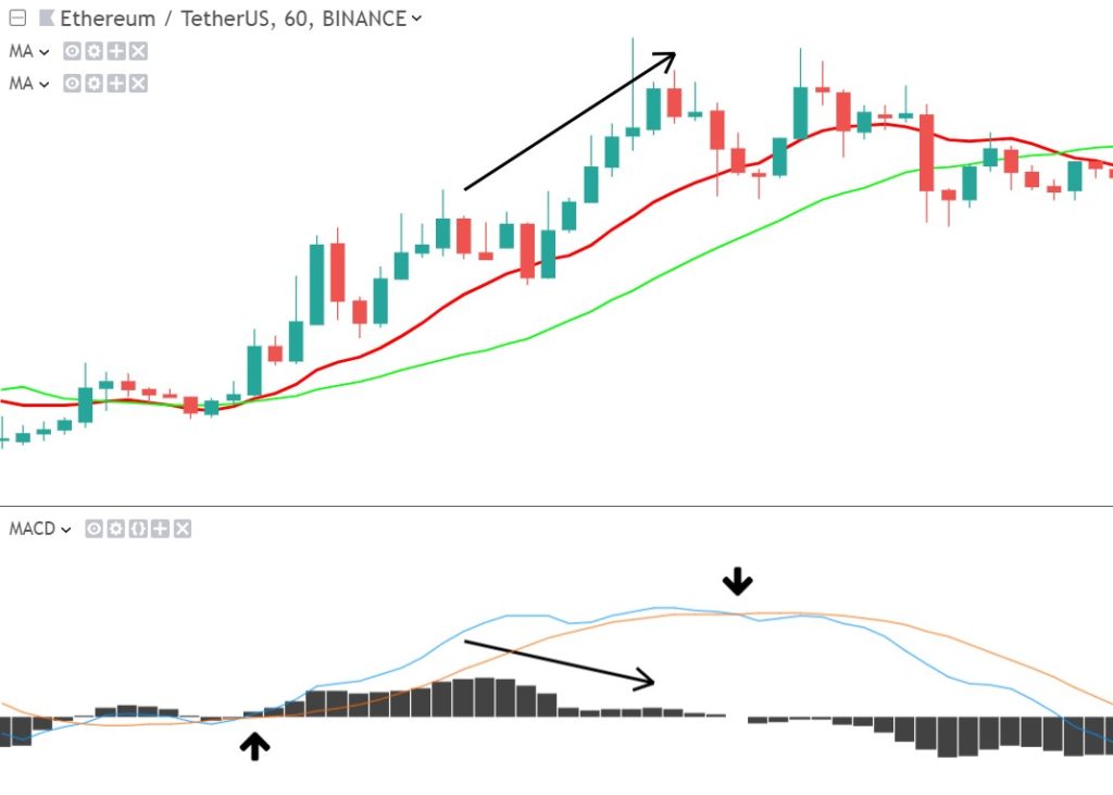
This is called a “divergence”. A divergence between price and the histogram. Price makes a higher high, while the histogram already made a lower high, a possible signal that momentum is fading.
As you have seen the MACD is not only a trend indicator, but also a real momentum indicator. But there are many more momentum indicators. This takes us to the next part of the “range-bound indicators”.
Range-bound Indicators
Most bounded indicators are “oscillators”. Oscillators are one of the most common indicator types. As you will see, the most common signals these indicators produce are crossovers and divergences.
RSI
The RSI is also an “oscillator”, it is contained between 0 and 100. Therefore it provides us with some different information than the MACD. The RSI indicator is a momentum indicator and thus measures the strength of the market, “Relative Strength Index”.
One of the hardest things (trend and pullback) traders need to do, is to detect if a move down is a small retrace or an actual end of a trend. Small retracement vs. entire trend reversal/ end of the trend. Momentum can help with this.
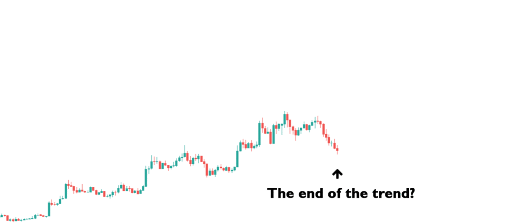
The RSI is an “oscillator”, but it is contained between 0 and 100. Therefore it provides us with another perspective than the MACD. The RSI indicator is a momentum indicator and thus measures the strength of the market, “Relative Strength Index”.
One of the hardest things (trend and pullback) traders need to do, is to detect if a move down is a small retrace or an actual end of a trend. Small retracement vs. entire trend reversal/ end of the trend. Momentum can help with this. These days traders use momentum indicators like the RSI a lot. Some even base their trading decisions solely on momentum.
Traders (myself included) call the RSI a leading indicator. This might seem confusing, as the RSI is also based on past prices. RSI is no “holy grail”, it’s just measureing the speed and strength of the market. Most of the time the market is already losing steam, before the end of the trend is visible in the price. RSI measures this rate of change. People trade according to the RSI, so it also has a self-fulfilling nature.
In the next example you see 2 price swings. Both lasted the same amount of time, but swing A made a bigger move obviously. This is how momentum is calculated: the amount that price moved in a particular period.
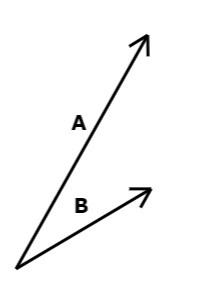
In physics momentum is mass x velocity. In trading momentum is just measured over past price change and there is no such thing as mass. A good approach is maybe to add volume to the momentum indicator (MFI indicator) as a replacement for mass. But the main difference is that in trading psychology plays a big role too. A panic drop can’t really be foreseen, that’s why it causes such panic and thus momentum.
So the RSI measure price changes. RSI is calculated over a lookback period, default this is 14 period. The longer this lookback period, the smoother the indicator line. The shorter, the closer it follows price. Even though the RSI follows price like a MA, it is not a trend indicator. When price drops lower or jumps higher, it just does so at a faster speed, creating the same move on the momentum indicator. When te market goes sideways, the speed at which price changes often changes much less, so the RSI also stays flat also.
A smoother line may visually look better, but a faster line responds better to price changes. But a fast RSI can cause more “whipsaw”.
As said the RSI in an “oscillator” type, bounded indicator, its value go from 0 to 100.
In reality it rarely touches 0 or 100, but more often turns at the 30 and 70 levels. Above 70 is called “overbought” and below 30 is called “oversold”. Many traders use these as buy or sell signals. But this is dangerous, as price can actually go much higher or lower.
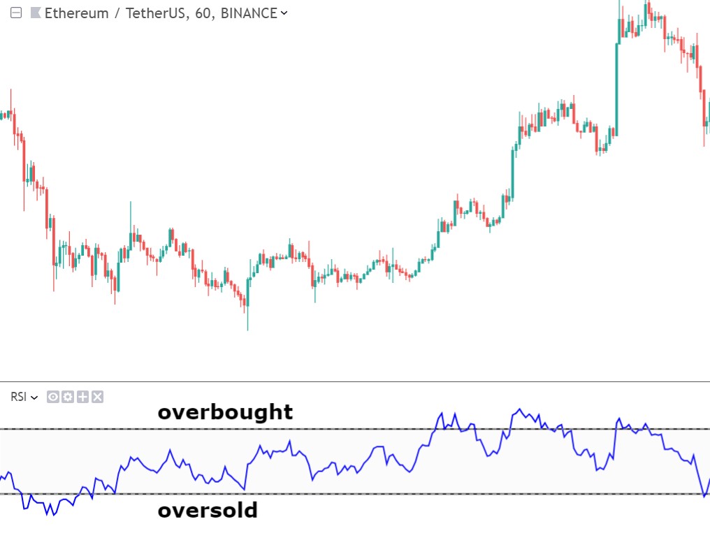
Especially in strong trends, RSI can remain in overbought/ oversold, while price reaches much further. But it is often true that price reverses to the downside, once it enters “overbought” territory and vice versa.
When I am trend trading I have the following (slightly personalised) rules regarding RSI:
- When RSI breaks above 50 it is in “bullish territory”. Below 50 is “bearish territory”.
- But only when RSI reaches above 60 it really signals an uptrend. When RSI reaches below 40 it signals a downtrend.
- When in an uptrend, it should respect the RSI 40 zone as support level. In a downtrend RSI should respect 60 zone as resistance.
- When RSI ranges between 40 and 60 (around 50) it is a sideways and indecisive market.
Besides moving averages , MACD, RSI these are some other indicators that I will soon look into in my next posts:
- ADX: Average Directional Index
- Aroon
- On-Balance Volume
- Stochastic
- Bollinger Bands
- ATR: Average True Range
Chart Patterns
Many people don’t know this, but plain old chart patterns are also indicators. As I already mentioned in the lesson about Chart Patterns, these patterns on chart can help you identify the next move. Like a “double bottom” gives you a confirmation that you have a buying opportunity. Some patterns are complex, and some are very simple. Look for example at these higher lows and higher high that signal an uptrend.

The 2 blue arrows indicate higher lows, and the red arrow indicated the higher high. Some Technical analysts call this a head-and-shoulders pattern, as you encountered in the Chart Patterns lesson. Works perfect, not? Now let’s compare this to some indicators:
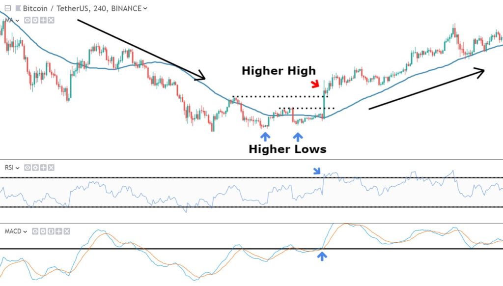
You see that the chart pattern is confirmed by RSI, it crossed above 60 (at blue arrow), and als confirmed by MACD, as it broke above the 0 line (also blue arrow), and the 50 period MA (blue line) started to slope up at the exact same point.
One more (very important) thing about chart patterns and indicators. If you combine chart patterns with indicators, then you can spot “divergences” between them. This actually one of my favorite trading signals! I will cover this in the next blogpost.
Or Enroll in the Pro Course & Become a Pro Trader!
